01 / Age 7+
Horizon
H2GP.
Competition identity, educational product communication and campaign design for hydrogen-powered student racing.
- Role
- Visual identity design · Campaign design · Product communication · Web design
- Scope
- Competition identity · Campaign concepts · Programme flyers · Product visualisation · Packaging communication · Website design · Early web-app concept

01 / The brief
Make the science
move.
Horizon Hydrogen Grand Prix turns fuel-cell engineering into something students can build, test, measure and race.
The programme connects clean-energy education with the urgency of motorsport. Students make decisions about efficiency, reliability, speed and endurance, then see those decisions perform on a physical track. Its communication therefore has to do two jobs at once: explain a credible engineering curriculum and generate the excitement needed to bring teams, schools, partners and sponsors into the system.
The engagement with Horizon Fuel Cell Technologies and its educational H2GP programme covered competition identity, campaign concepts, product presentation, programme flyers and digital design. The communication approach brought the programme’s engineering content and competitive format into a consistent visual system.
Design highlights
- Identity construction
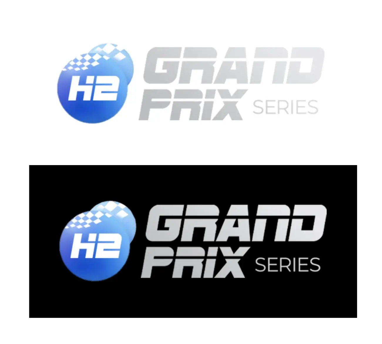
- An H2 sphere and pixelated chequered flag combine with a condensed, forward-leaning wordmark in light and dark lockups.
- Product diagrams
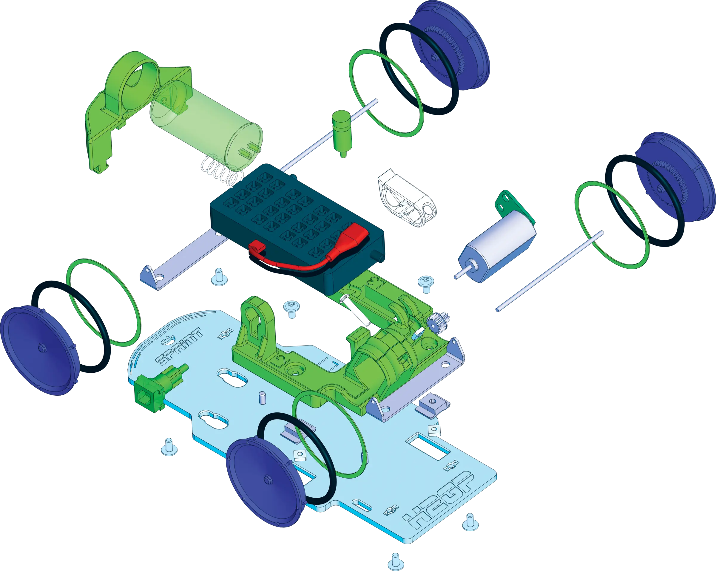
- An exploded Sprint-car composition separates the chassis, wheels, motor, fuel-cell components and body to explain the product’s assembly.
- Campaign layouts
- XPR and Sprint share a red campaign layout with large product imagery, direct headlines and supporting programme identifiers.
02 / Competition identity
Hydrogen,
at race pace.
The mark combines the scientific subject with the visual reflexes of racing.
A hydrogen-blue H2 sphere becomes a compact programme emblem. Chequered pixels break from its edge and connect the energy source to the finish line, while a condensed, forward-leaning Grand Prix wordmark supplies speed and competitive presence. The construction remains legible in institutional light environments and high-contrast race settings.
This dual register was essential. H2GP needed the authority to sit inside a school programme and the energy to command a public event. The identity does not choose between those contexts; it gives both of them the same point of origin.
03 / Programme architecture
One route.
Three entry points.
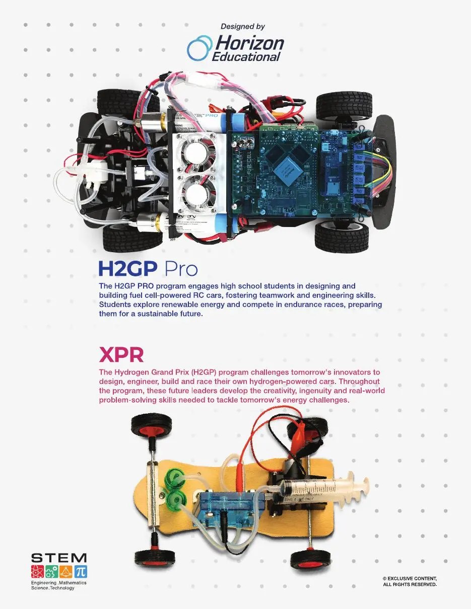
The communication system had to make progression visible without flattening the character of each level. Every programme starts from hands-on discovery and adds engineering depth, performance pressure and team responsibility.
02 / Age 10+
Sprint
Build. Tune. Race.A fast 1:20-scale platform for assembly, testing, gear ratios, chassis thinking and track data.03 / Age 13+
Pro
Engineer. Endure. Compete.Advanced fuel-cell vehicles, race strategy, reliability and international endurance competition.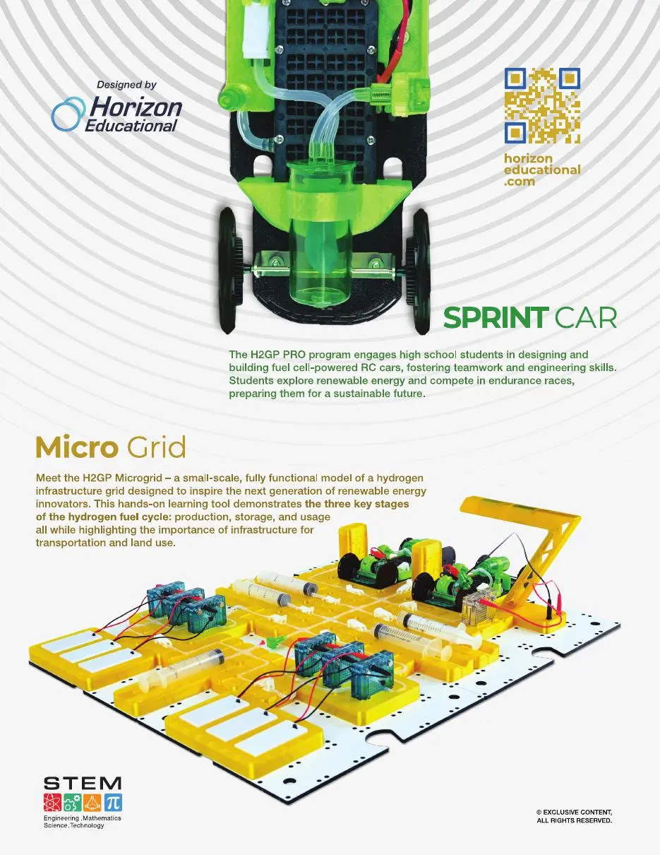
04 / Product communication
Show how
performance is built.
A classroom product becomes more valuable when its engineering is visible.
The exploded Sprint composition turns a finished car into a readable system of chassis, wheels, motor, fuel-cell components and body parts. The graphic helps the audience understand that speed is assembled from choices rather than delivered as a sealed toy.
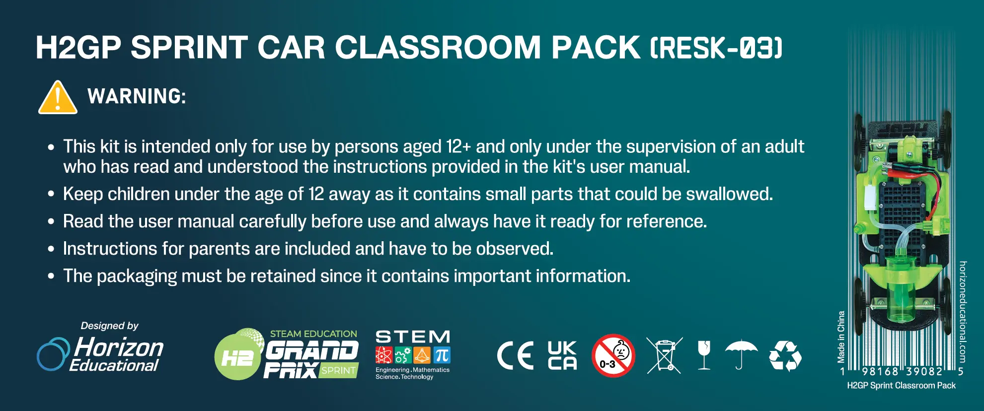
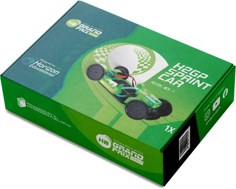
Packaging, safety information and product imagery carry that logic into purchase, storage and classroom use. Regulatory marks and warnings remain precise; the visual presentation still communicates experimentation, motion and team ownership.
05 / Campaign
Give curiosity
something to build.
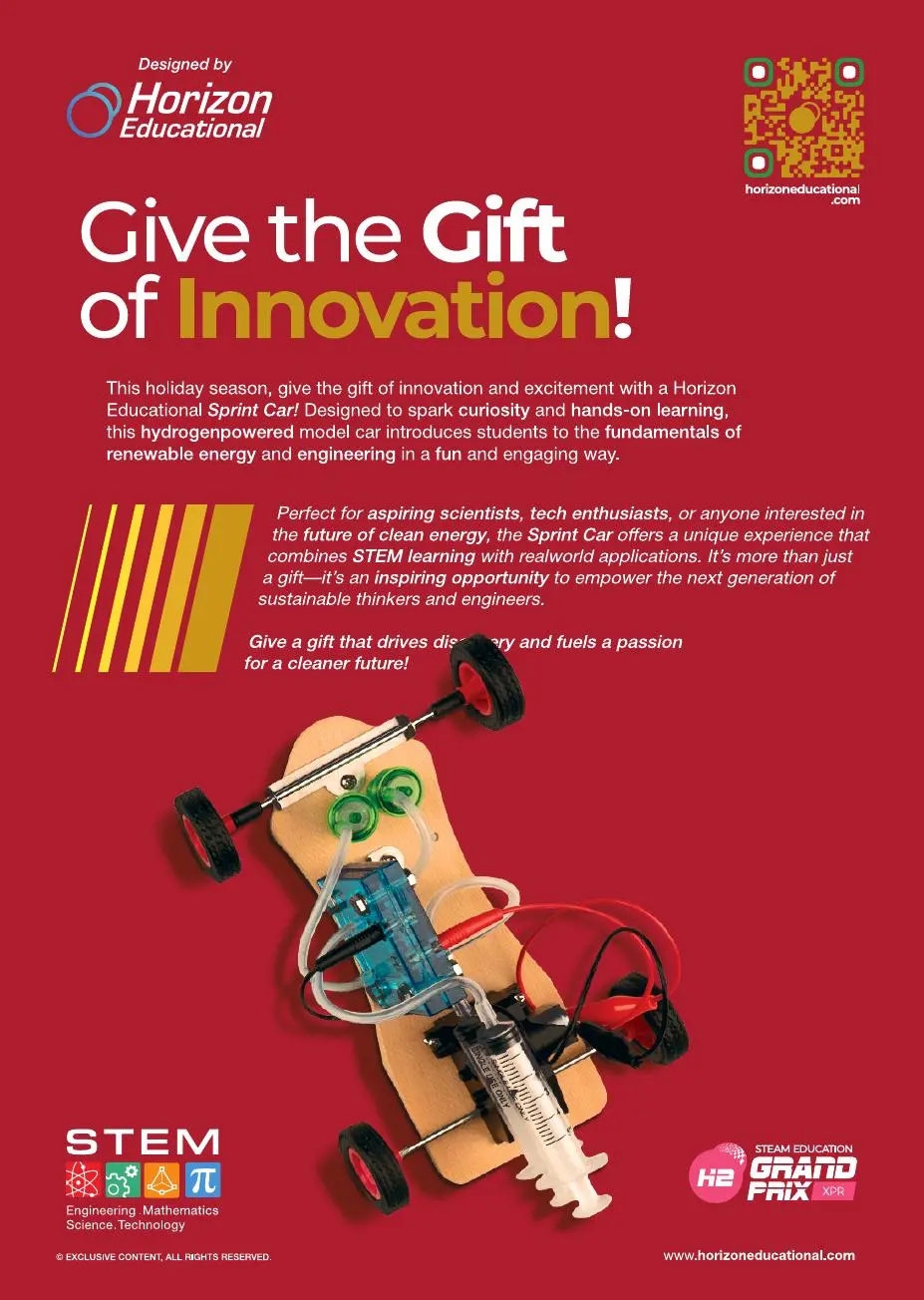
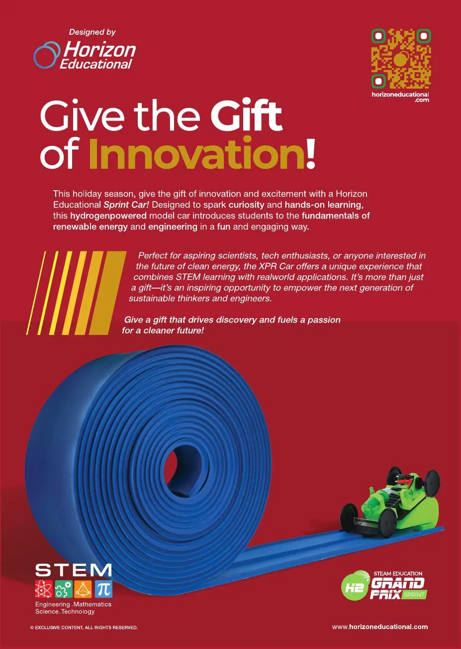
The Give the Gift of Innovation campaign reframes educational hardware as an invitation to act. A direct headline, saturated red field and oversized product image create retail immediacy, while the programme logos and supporting copy keep the proposition anchored in renewable energy, engineering and STEM learning.
XPR and Sprint share the same campaign architecture but retain different product stories: one foregrounds the exposed, handmade logic of the model; the other turns a roll of blue track into a graphic expression of speed and possibility.
06 / Competition environment
The classroom
opens onto the world.
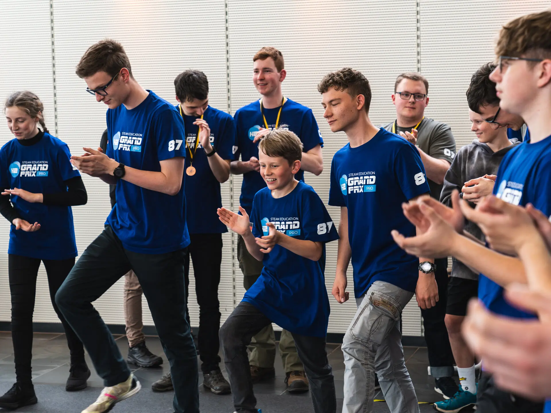
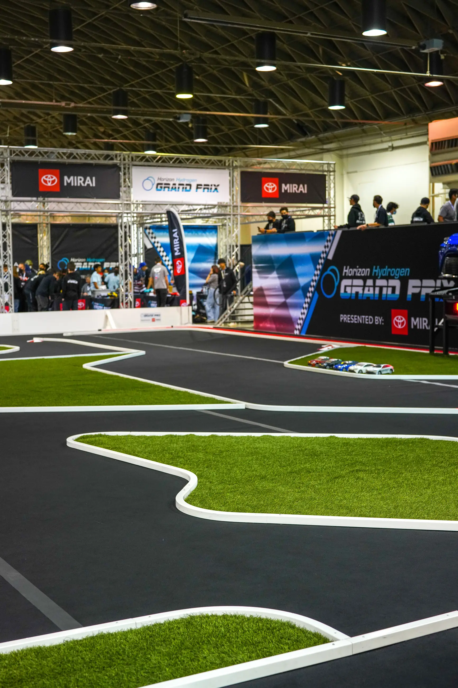
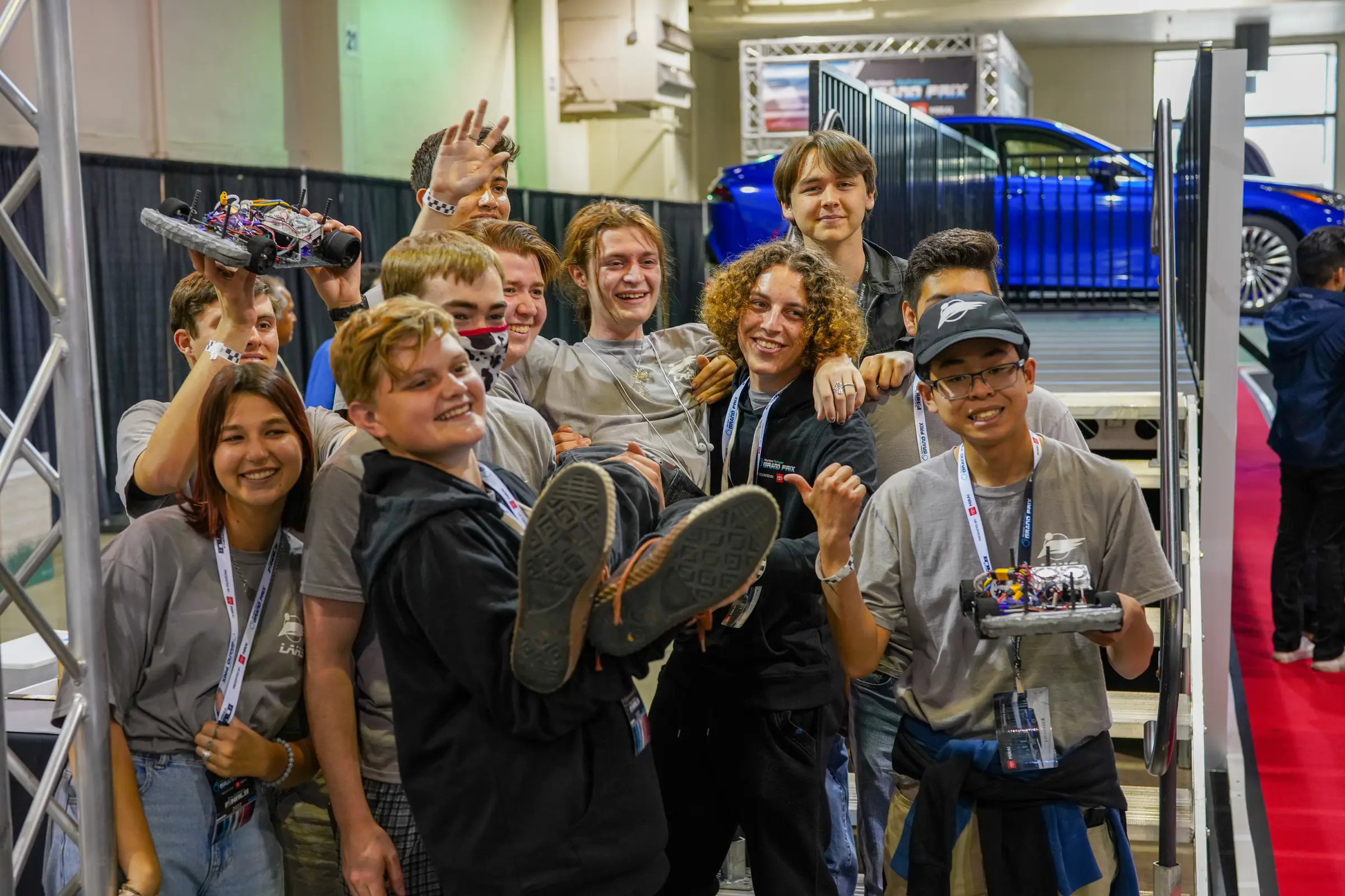
H2GP's public value becomes clearest at the track. Teams arrive with vehicles they have built and refined together; technical choices become visible as lap time, endurance, reliability and repair; and an abstract clean-energy topic becomes a shared international event.
The identity and communication system needed to remain coherent at this larger scale—from a classroom package to race graphics, team apparel, sponsor visibility and the collective image of the competition itself.
07 / Digital extension
The next layer
is interactive.
Website design and an early web-app concept extended the engagement beyond static communication.
The digital remit addressed programme discovery and participation, connecting introductory information with the appropriate learning and competition level. This case study presents the identity, product communication and campaign work; interface screens are not included.
WebsiteWebsite designWeb appEarly concept
08 / System value
From component
to competition.
The project connects technical credibility, educational clarity and competitive energy across one recognisable system.
Identity creates the signal. Product communication reveals what students can build. Campaigns turn that possibility into an invitation. Competition imagery shows the scale of the community waiting at the end of the process. Together, those layers make H2GP legible not as a one-off race, but as a progressive route into hydrogen engineering.
- Credits
- Design by Hazhin Roshanysefat during an engagement with Horizon Fuel Cell Technologies / Horizon Educational · Event photography supplied by the client