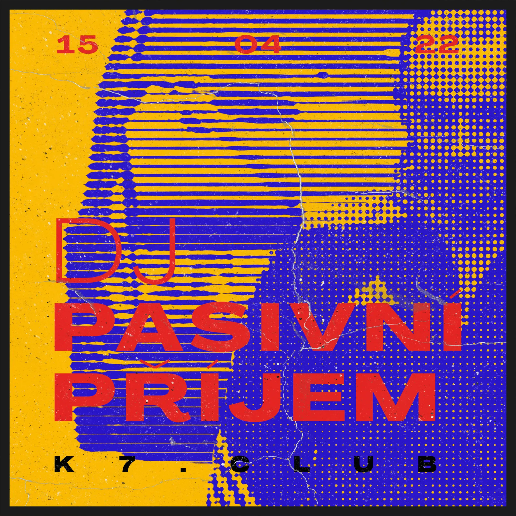
DJ Passive Income
Saturated halftone, compact information and club-poster immediacy.
Case study / 16
Prague · Bar & event space
Brand identity and ongoing visual communication for a Prague bar and event space.

01 / From the beginning
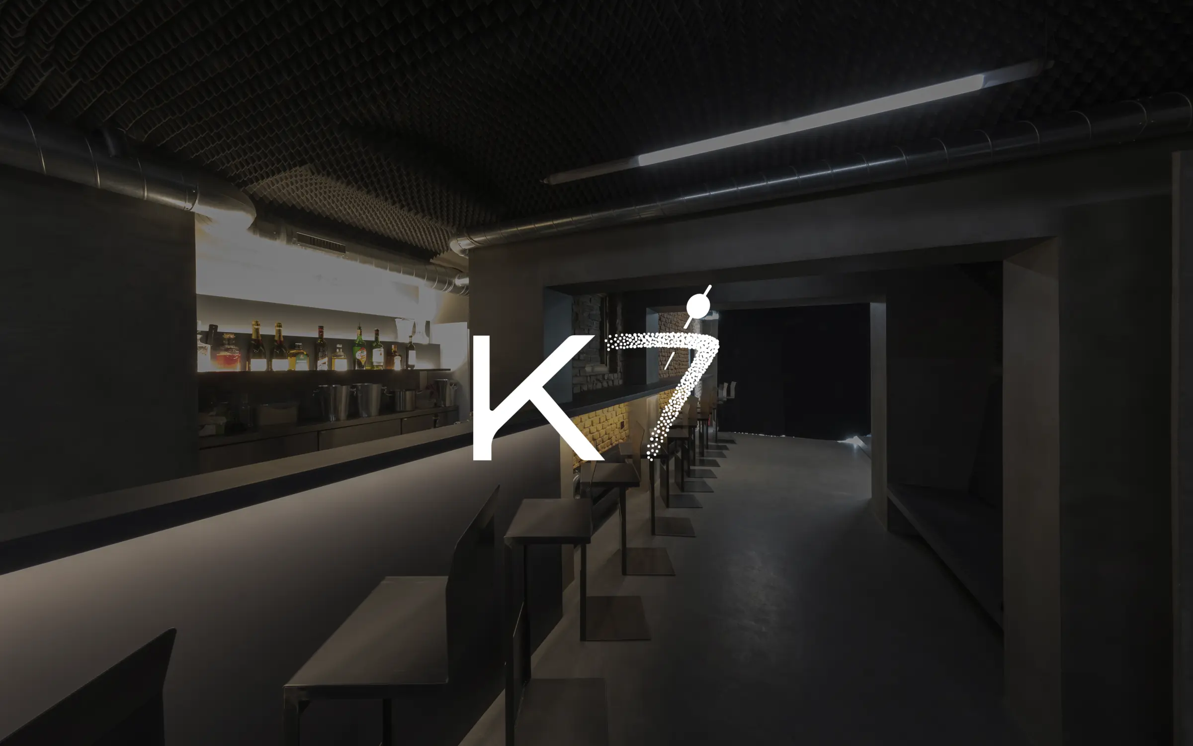
The K7 engagement began before the venue had an established public visual identity.
The first task was the logo and typographic foundation. From there, the work expanded with the venue itself: launch communications, Instagram and Facebook, event identities, motion, photography and the visual decisions needed to keep a changing programme recognisably K7.
The identity had to identify the venue while leaving room for the artists on its programme. The monochrome K7 signature provides that recurring point of recognition. Event imagery, colour and composition can change around it, while the artist, date and venue remain distinct levels of information.
02 / Identity
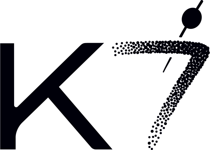
The K and 7 are treated as one energetic gesture. The hard diagonal of the K meets a seven that shifts from a solid stroke into a field of dots; a small cocktail pick completes the mark without turning it into a conventional bar symbol.
Built in black and white, the identity stays legible over photography and gives more expressive event graphics room to change around it. PP Agrandir supplies the supporting typographic voice: bold, contemporary and capable of carrying both functional information and oversized headlines.
Story Highlights
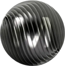
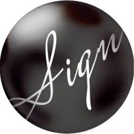
Four material worlds turn functional archive covers into small pieces of the brand atmosphere.


04 / Event identities
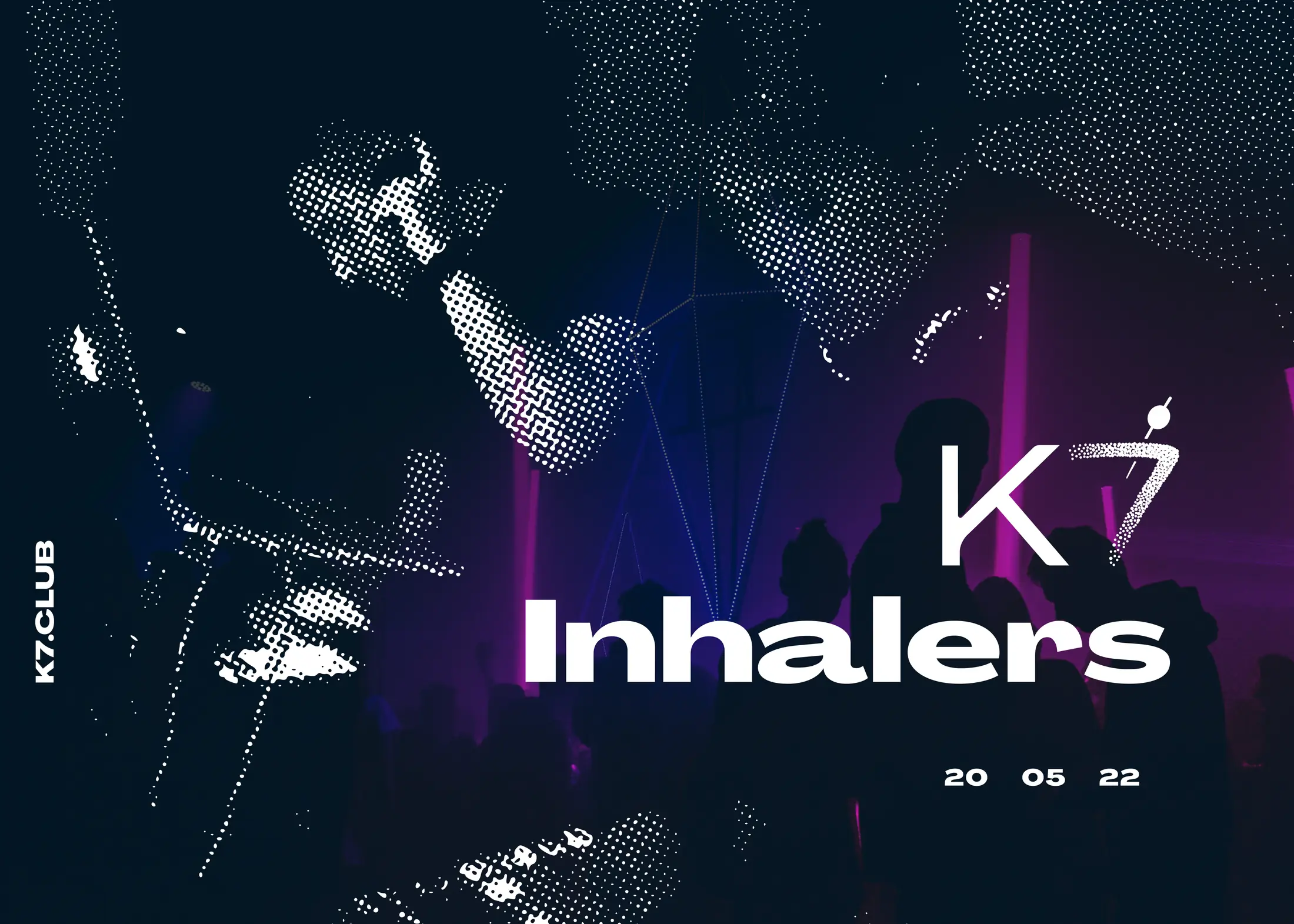
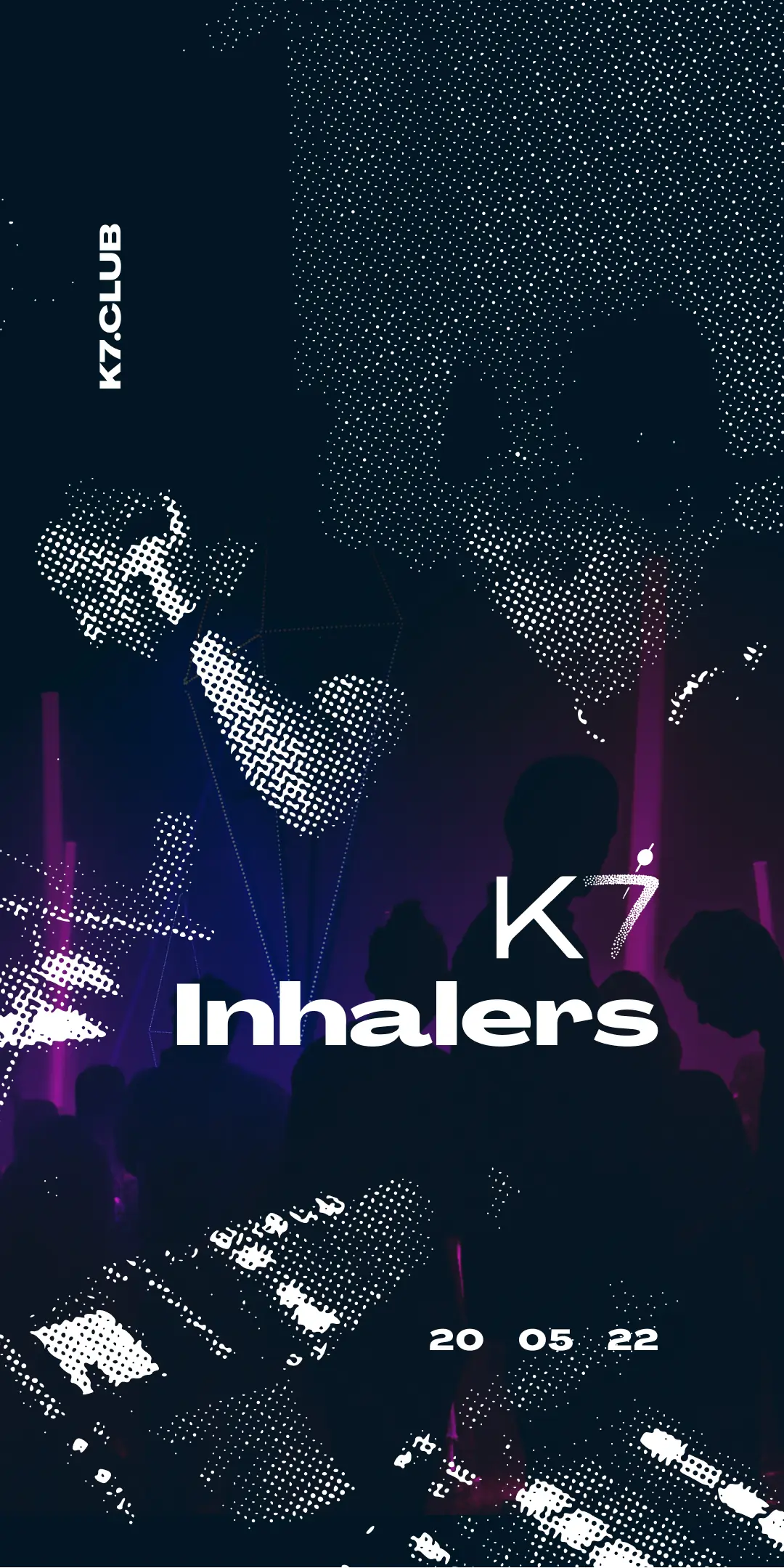
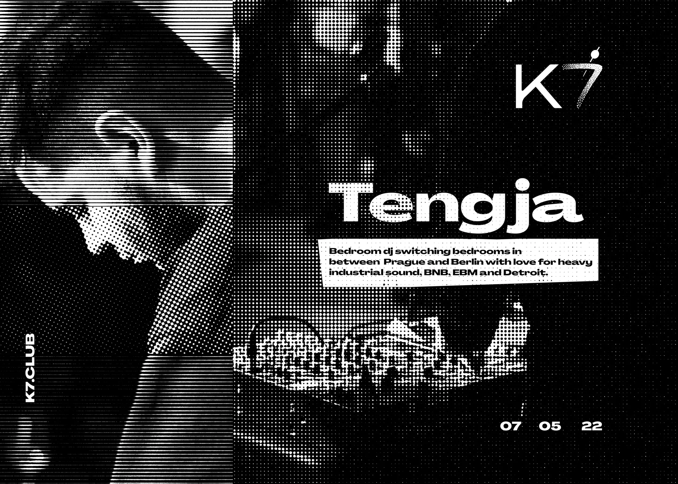
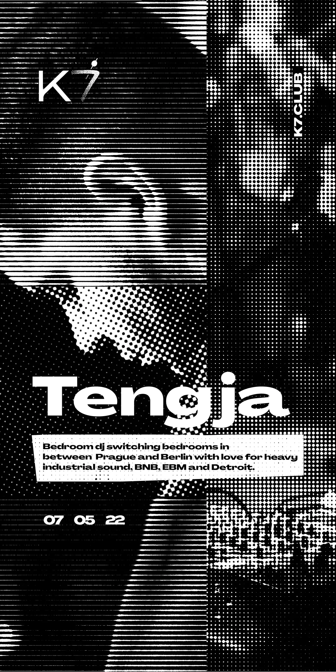
The event series separates the venue identity from each artist’s visual treatment. The K7 mark signs the work; the artist’s name and imagery give each night its own emphasis. Reworking the composition for posters, square posts and vertical Stories preserves that hierarchy across different proportions.
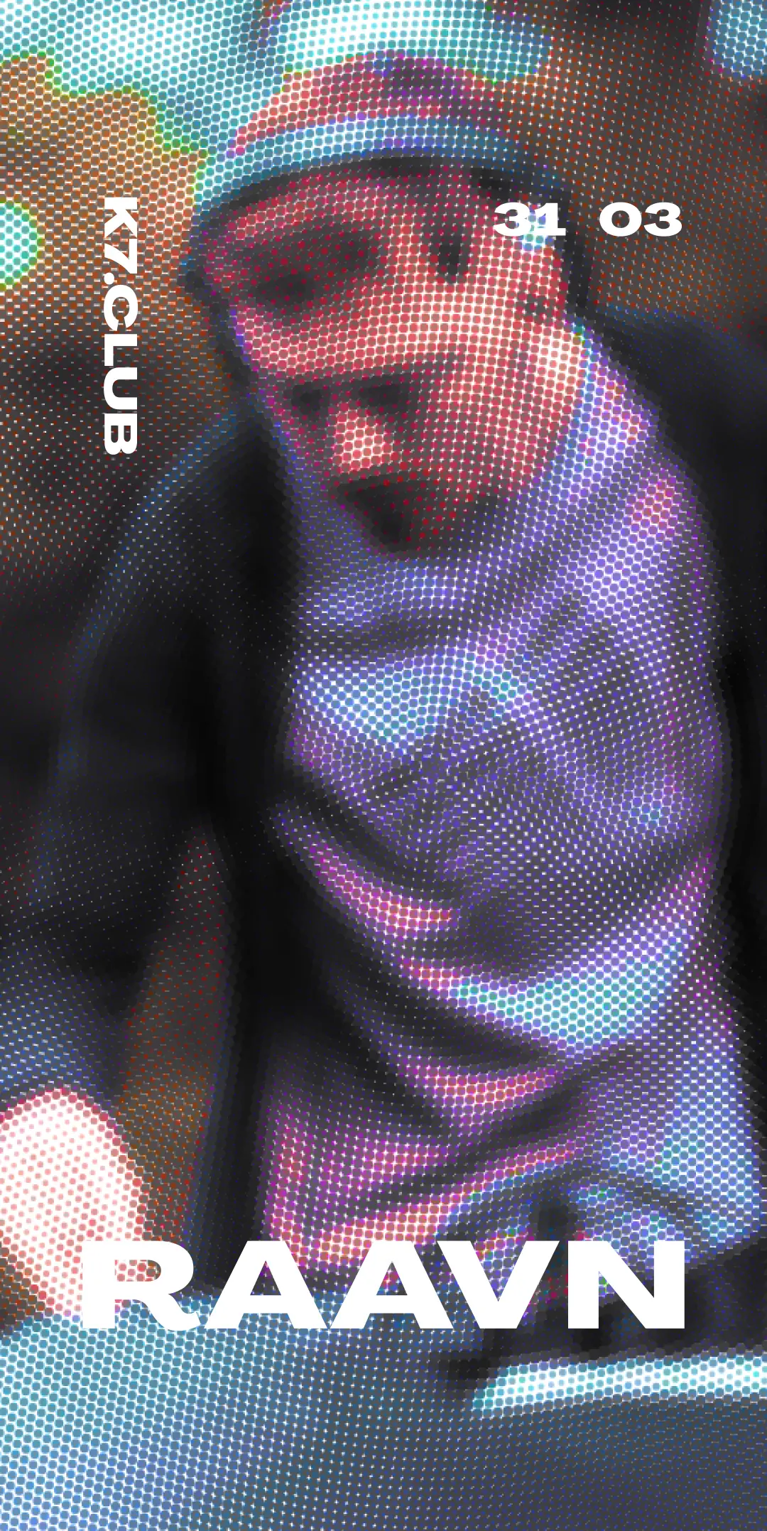
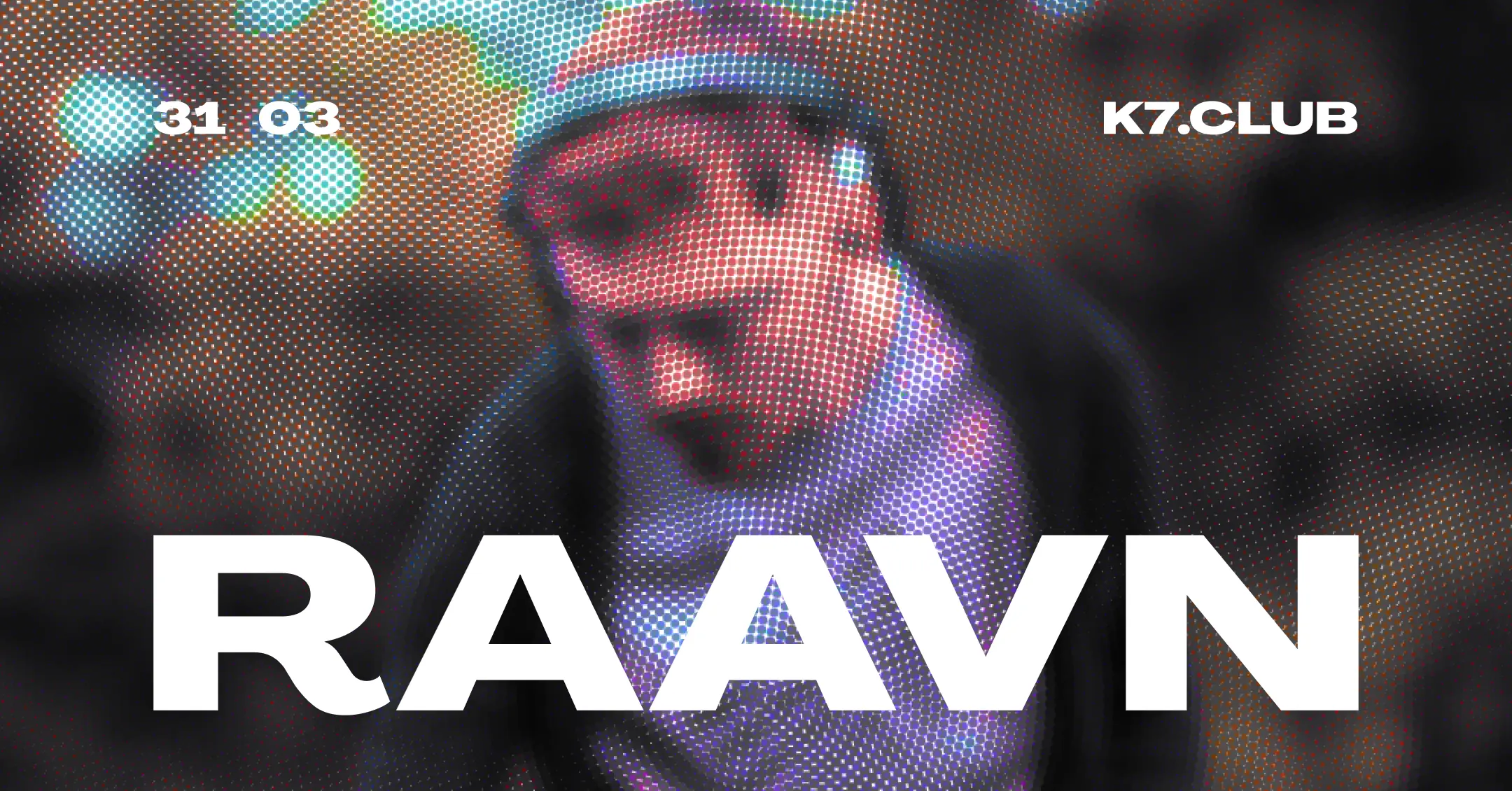
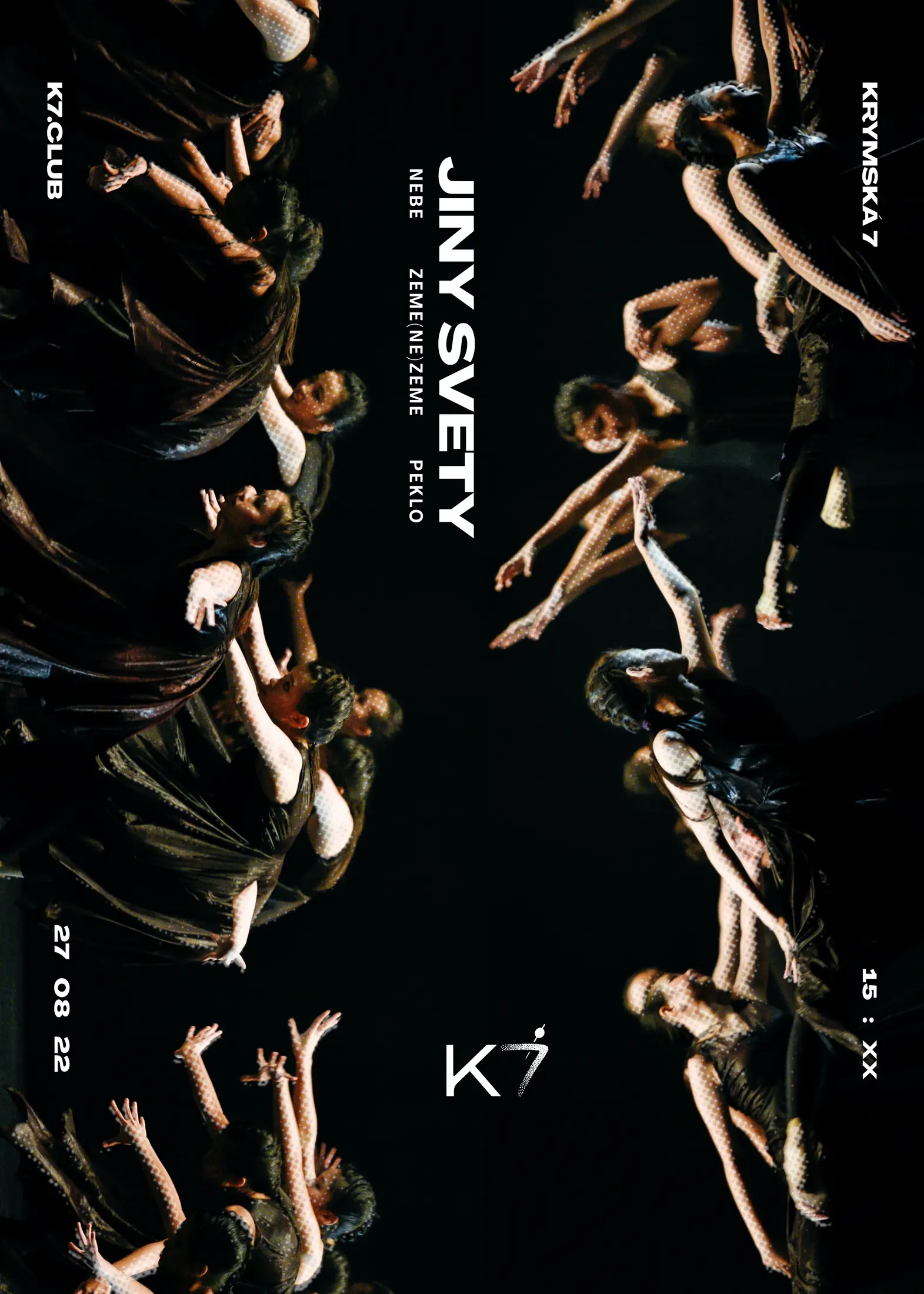
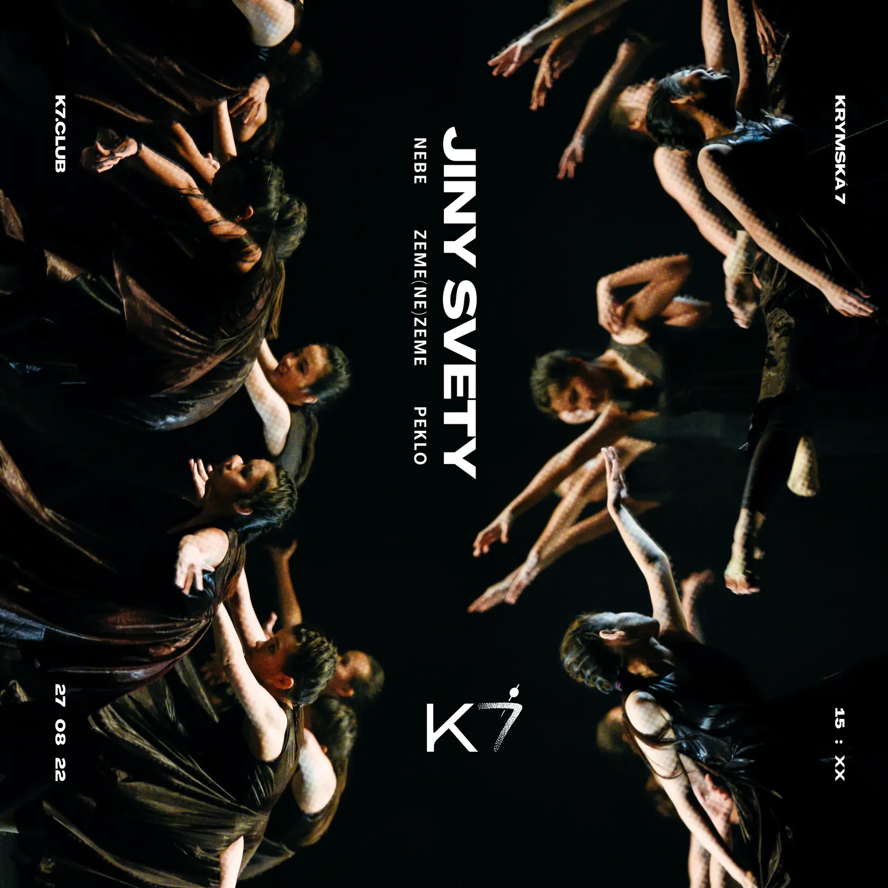
The selected campaigns move from the saturated halftone energy of DJ Passive Income and the blurred screen texture of RAAVN to Jiný Světy's circular human composition, Inhalers' violet performance collage and Tengja's fragmented monochrome grid.
Saturated halftone, compact information and club-poster immediacy.
A blurred, screen-like portrait system built for fast recognition.
A ring of movement translated from poster to square social format.
Performance photography, violet light and a hard-working type hierarchy.
Monochrome scan texture and a modular grid stretched across formats.
05 / Motion & video
Selected event campaigns extended into motion graphics and video. Rhythm, sequencing and transitions introduced movement while preserving the typographic hierarchy and campaign identity across social formats.
06 / Photography art direction
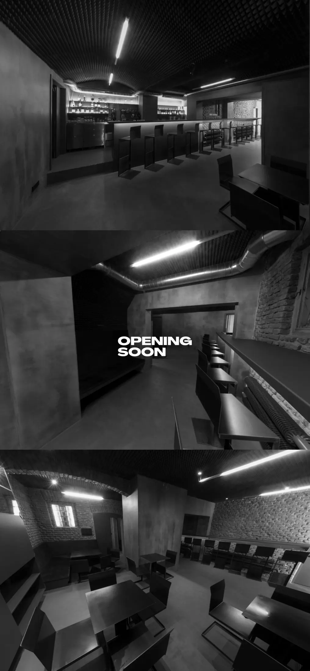
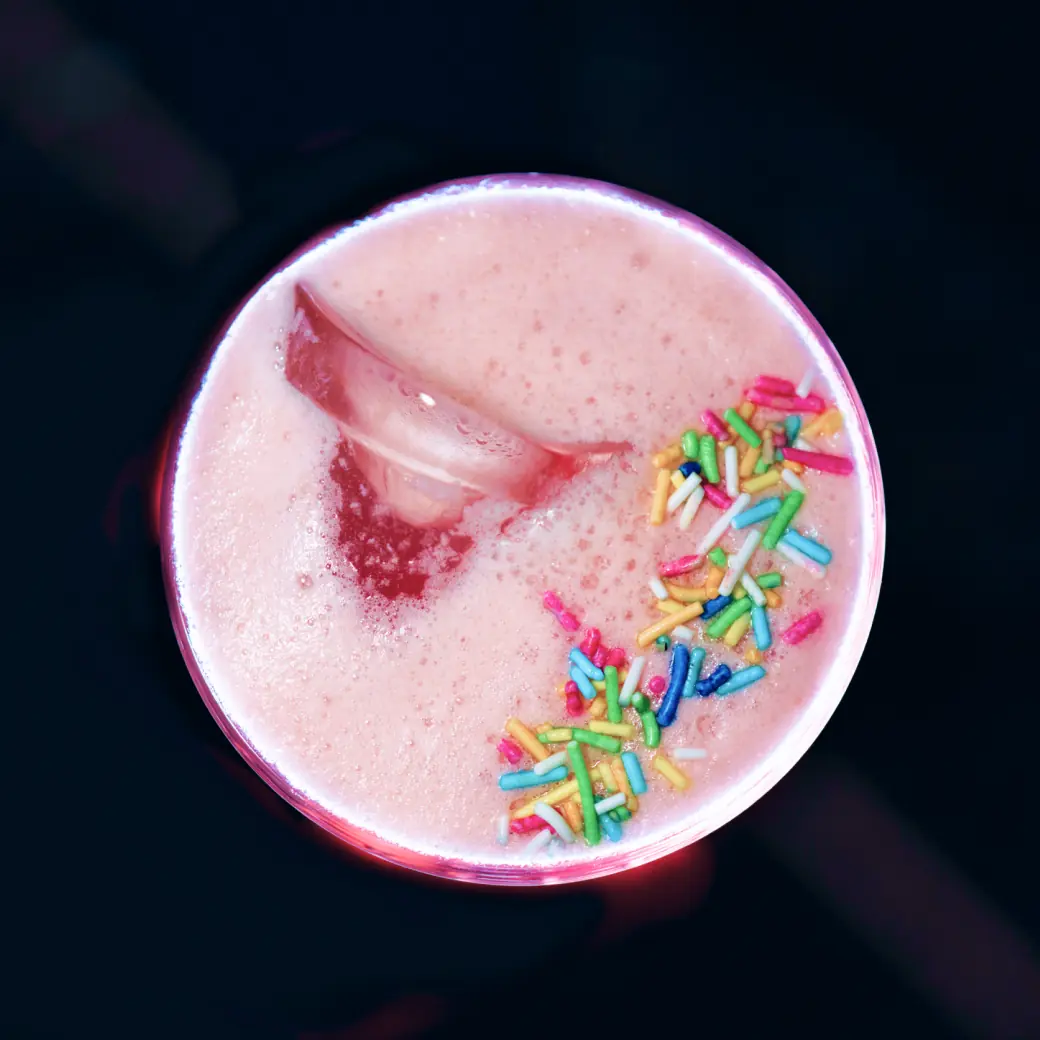
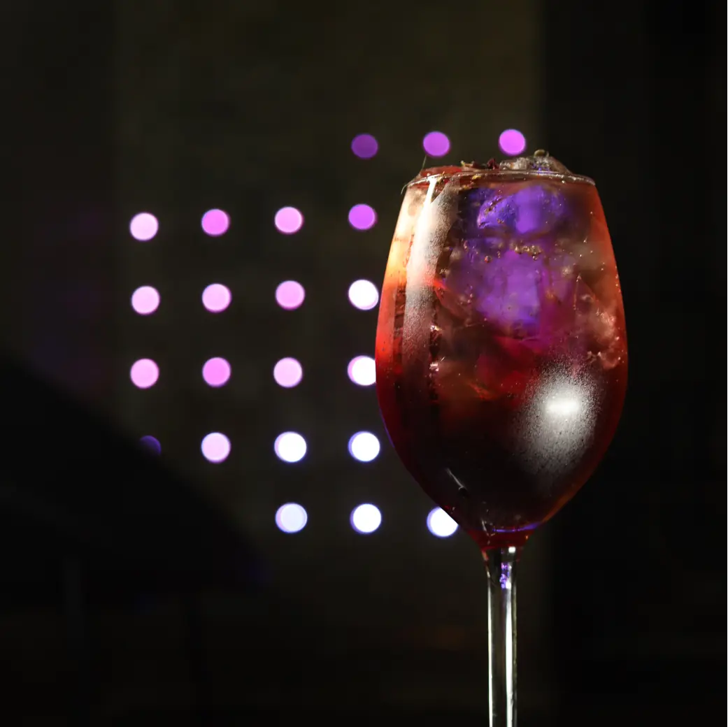
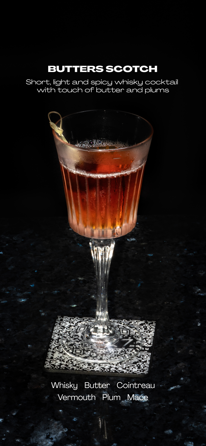
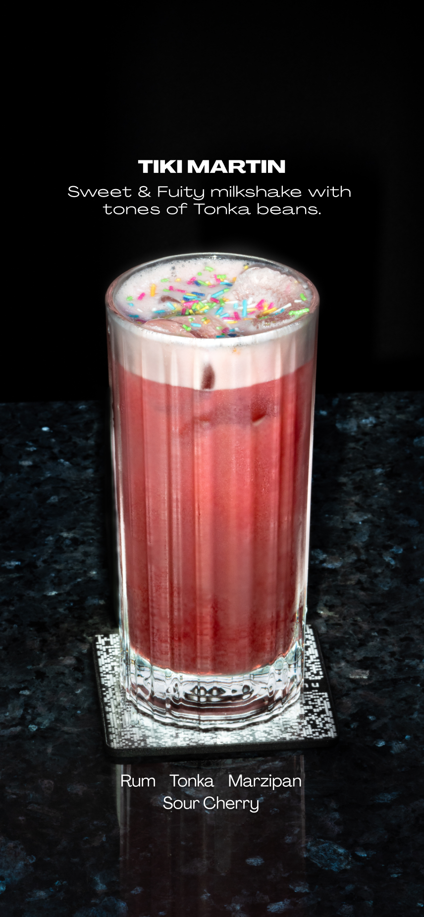
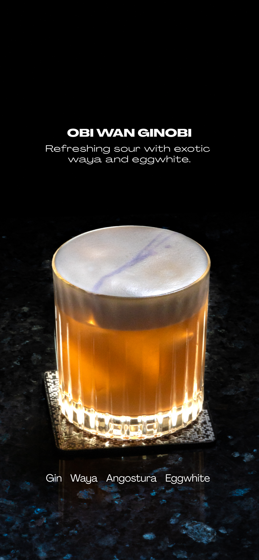
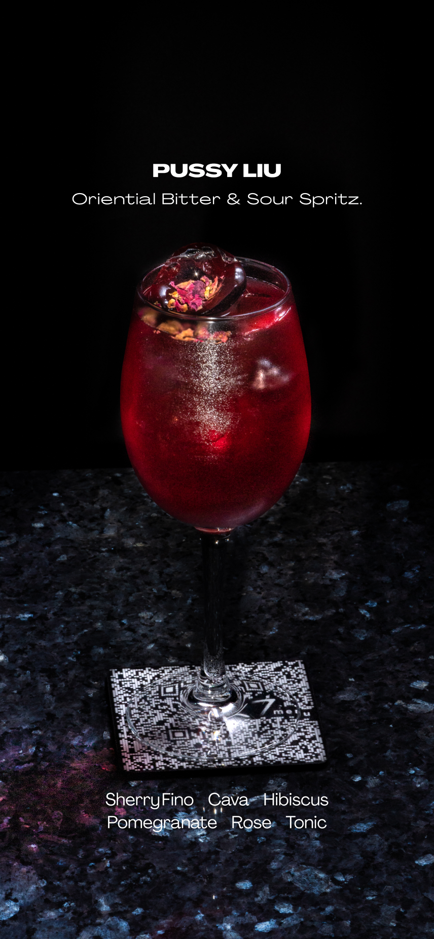
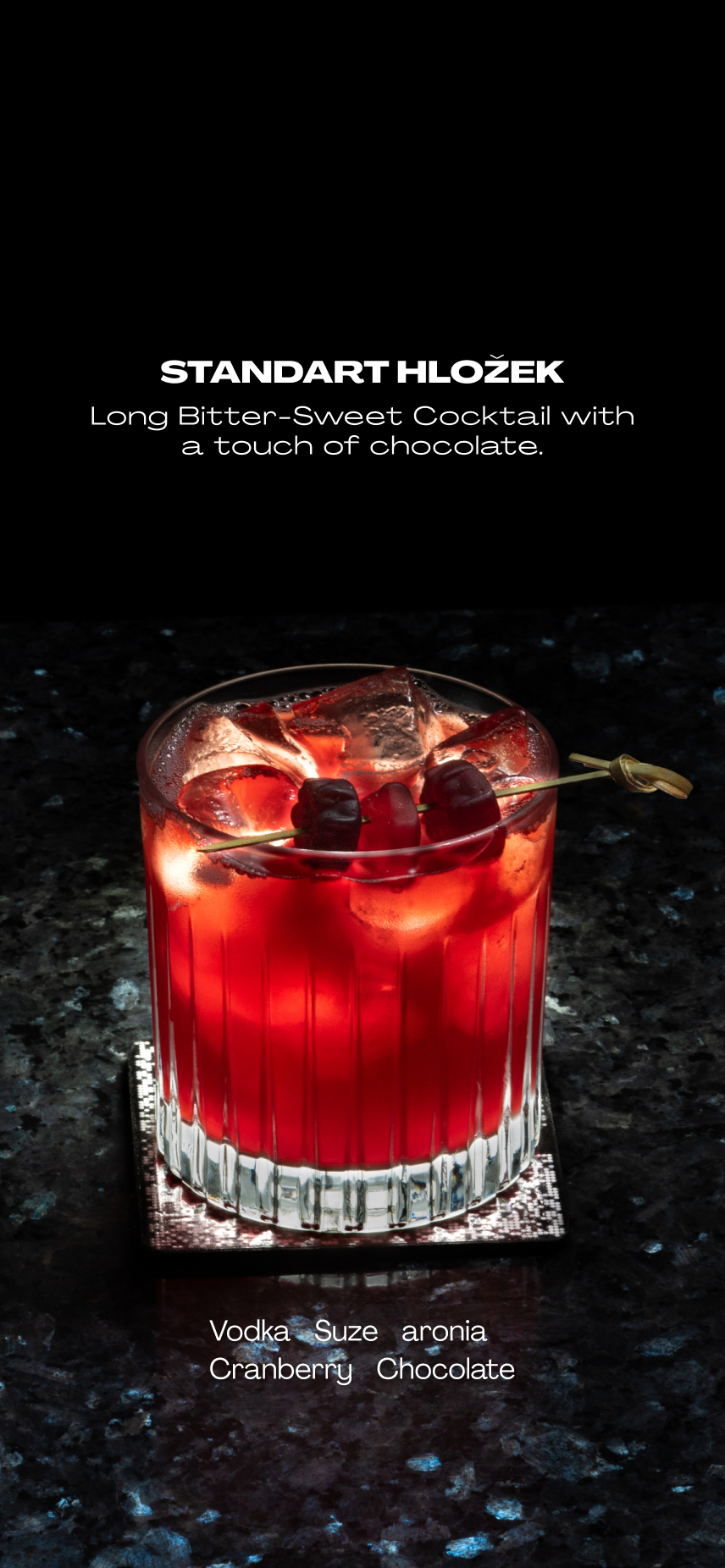
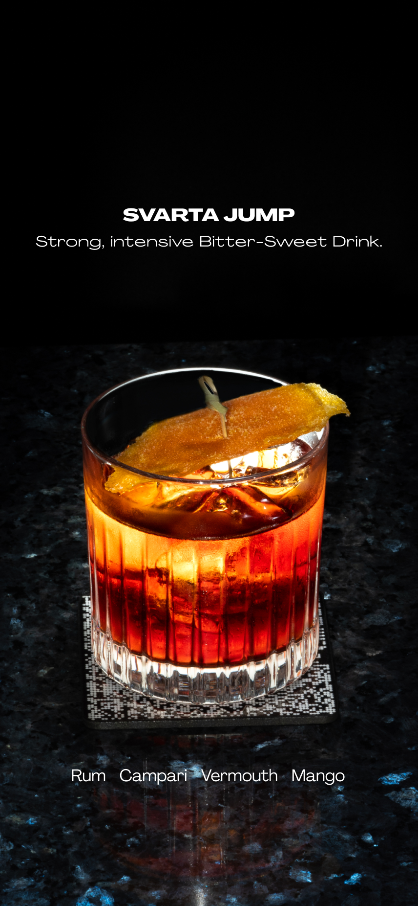
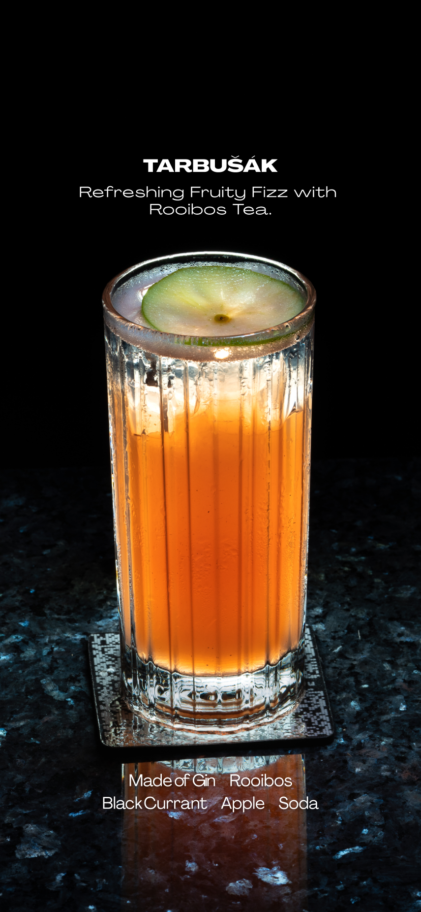
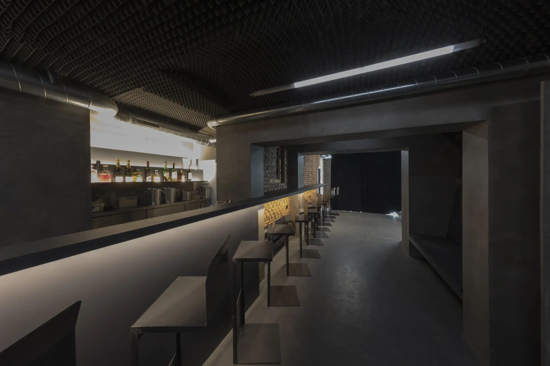
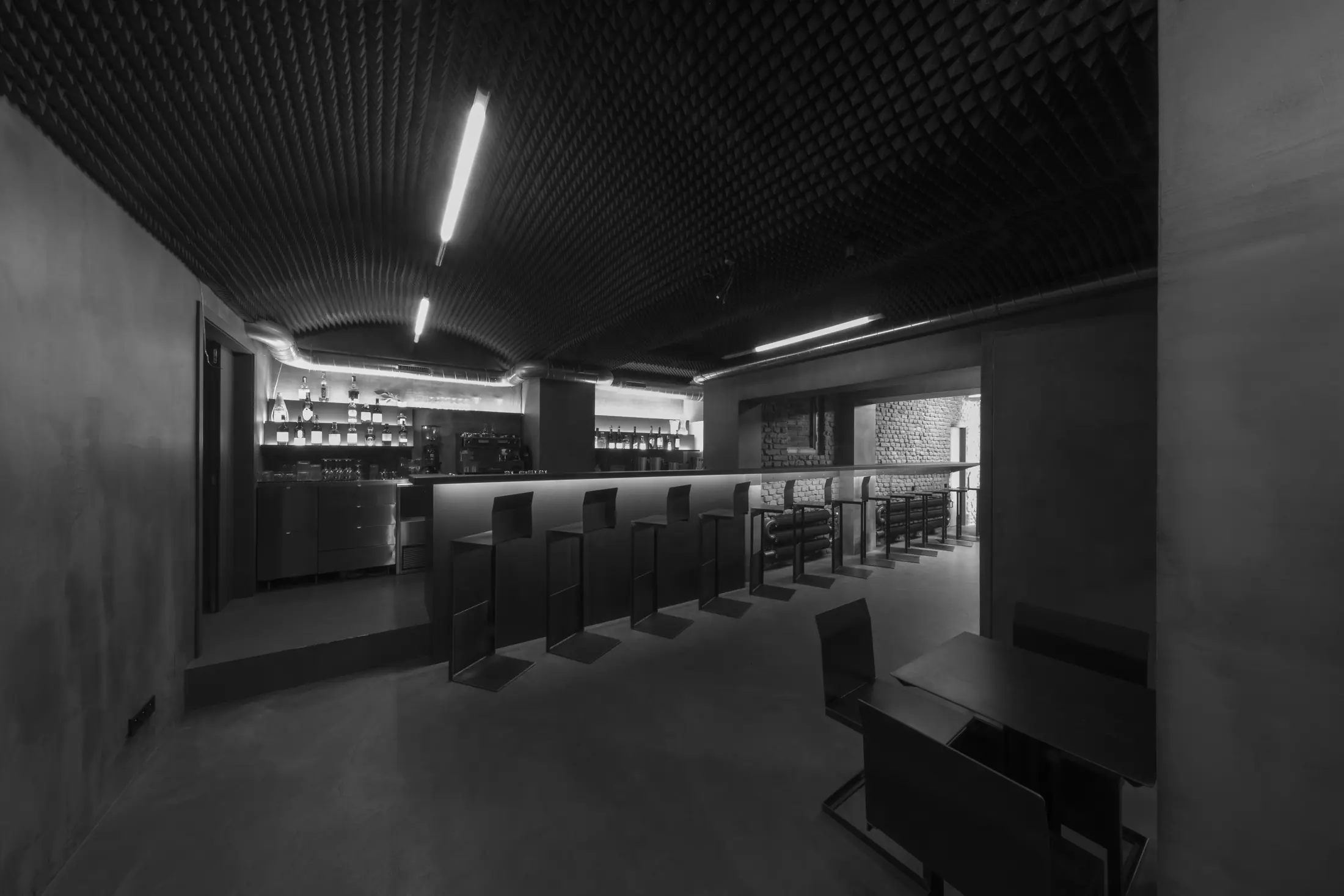
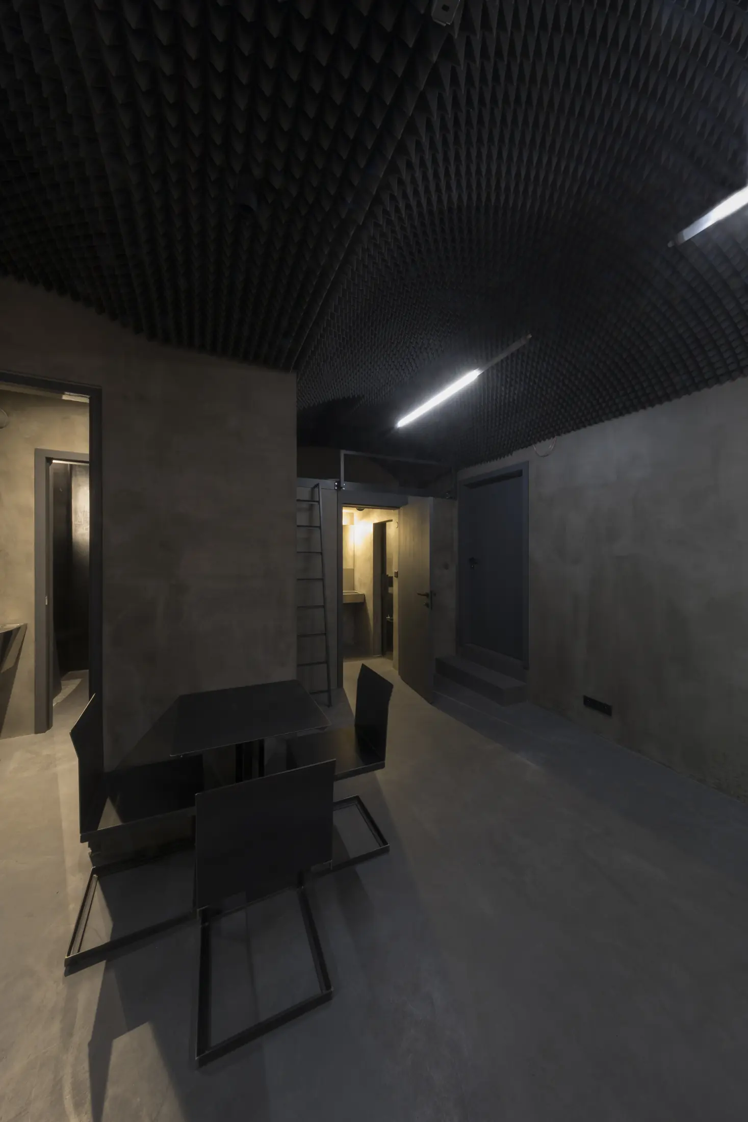
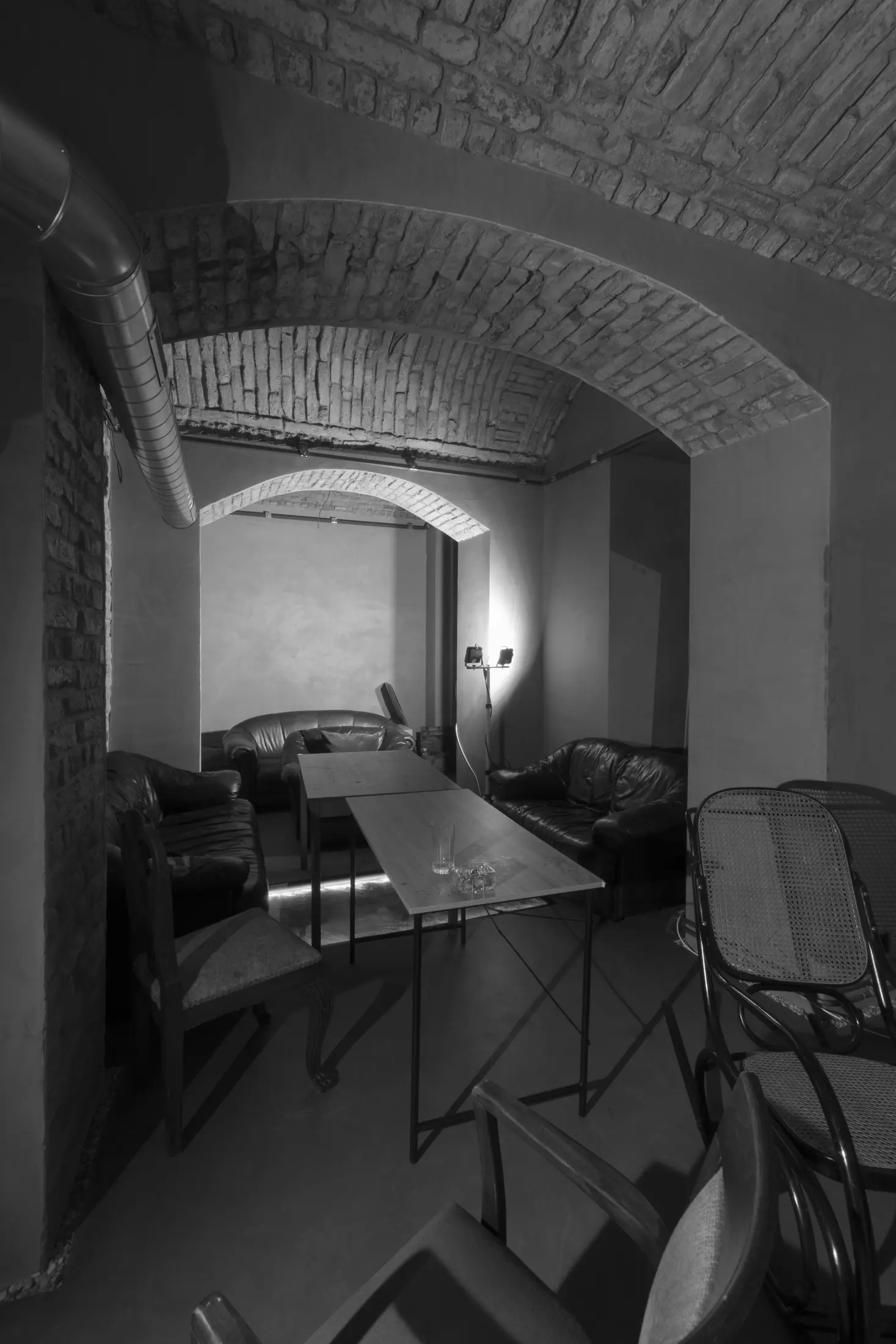
Photography art direction covered concept development and visual direction for drink and interior series produced with several photographers. On-set direction for selected shoots addressed camera angle, lighting, composition and the relationship between subject and space, aligning the images with K7's visual identity.
The drink and interior series use different scales of observation. Close views, shadows and controlled colour isolate the drinks; wider architectural compositions describe the bar and its materials. Together, they give K7’s communications both product imagery and a sense of the place those products belong to.
07 / The value of continuity
K7 grew through accumulated decisions: an identity made operational, a launch system expanded into an active social voice, event graphics that stayed distinct, and photography directed to make the venue's drinks and interior feel like parts of the same world.
Design and art direction across these phases established a consistent visual language. Artists, formats and collaborating photographers could vary while the venue retained a recognisable identity.