
Duality
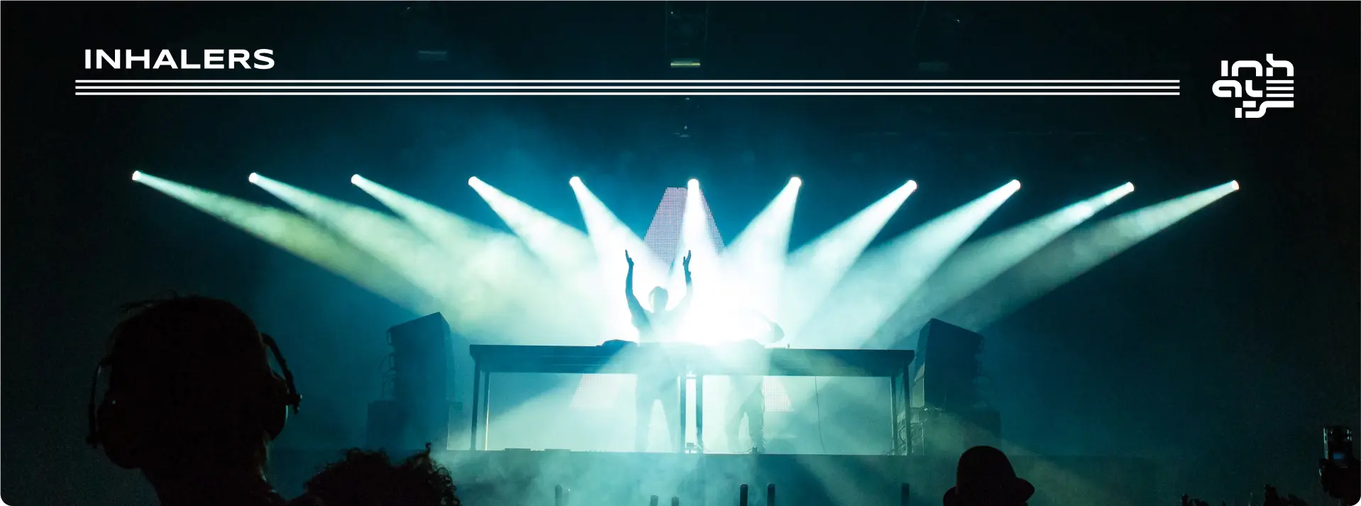
Two performers held inside one compact visual field.
Case study / 18
Visual identity · 2022—2023
Inhalers
01 / The beginning
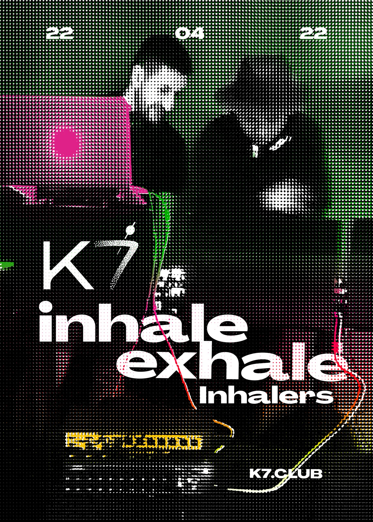
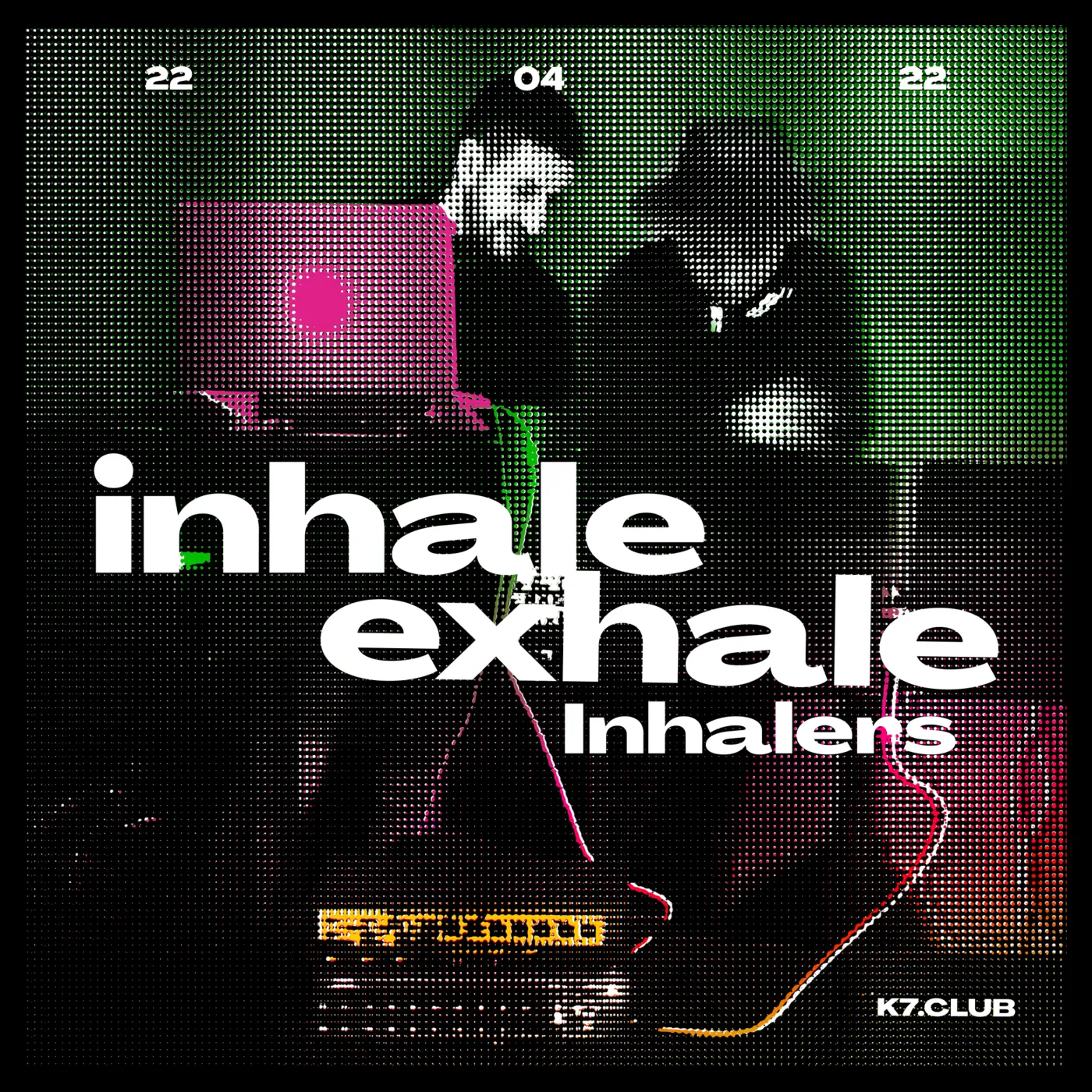
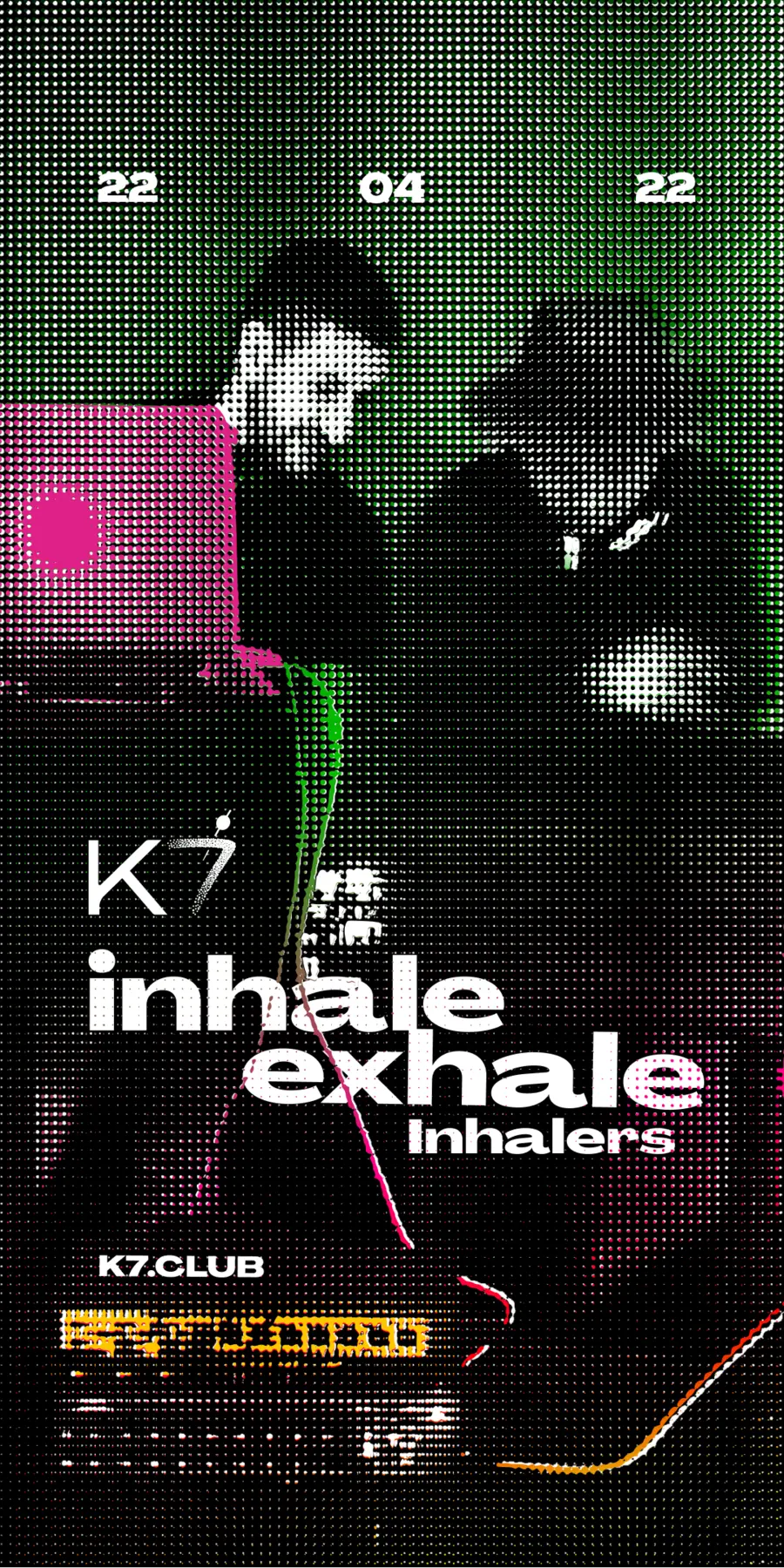
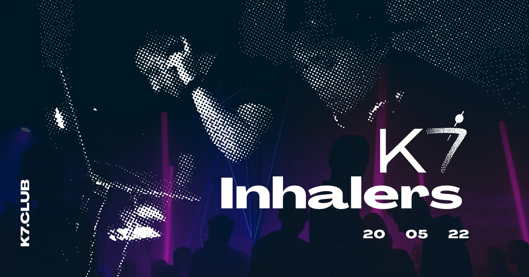
The collaboration with Inhalers began through event promotion at K7. A poster, Instagram post, Story and Facebook cover formed the initial campaign. After seeing the work, the duo commissioned an independent visual identity for use beyond the venue.
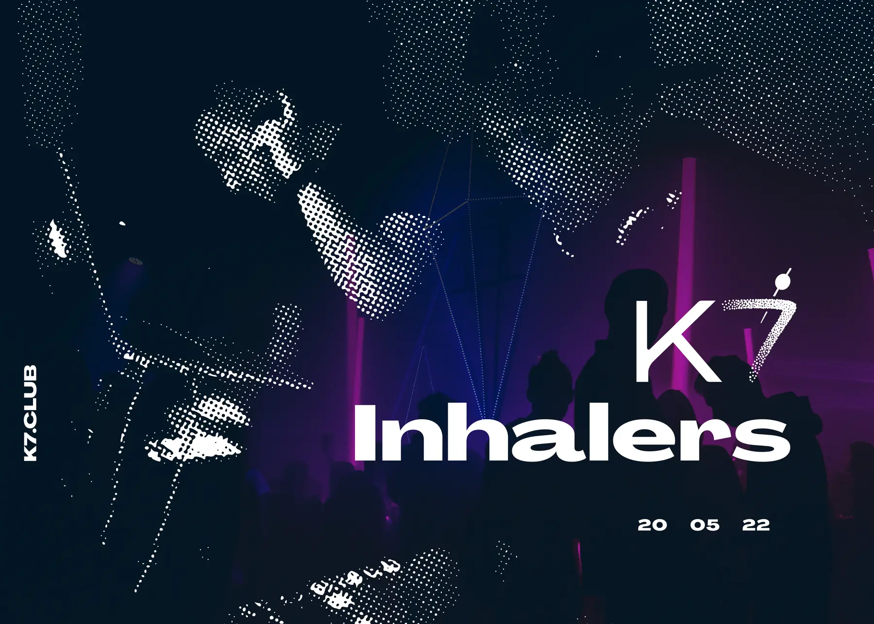
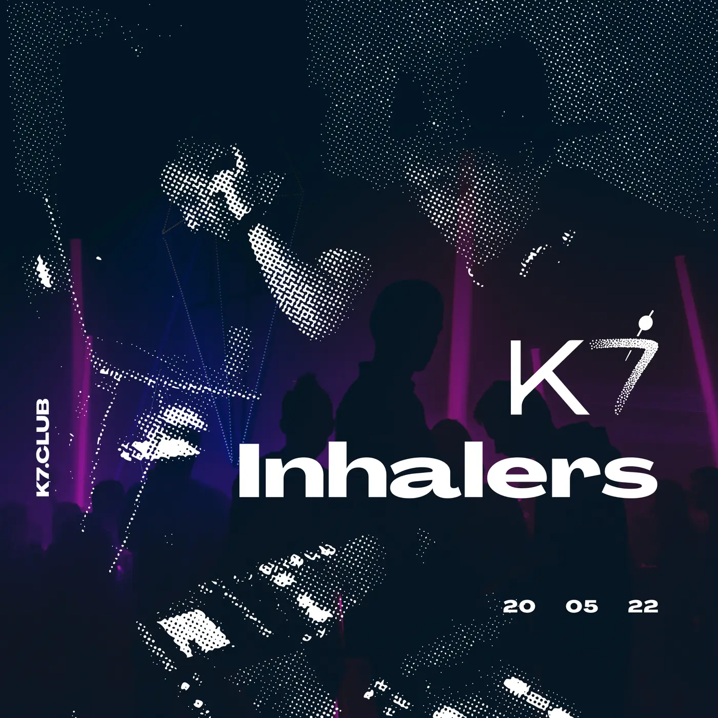
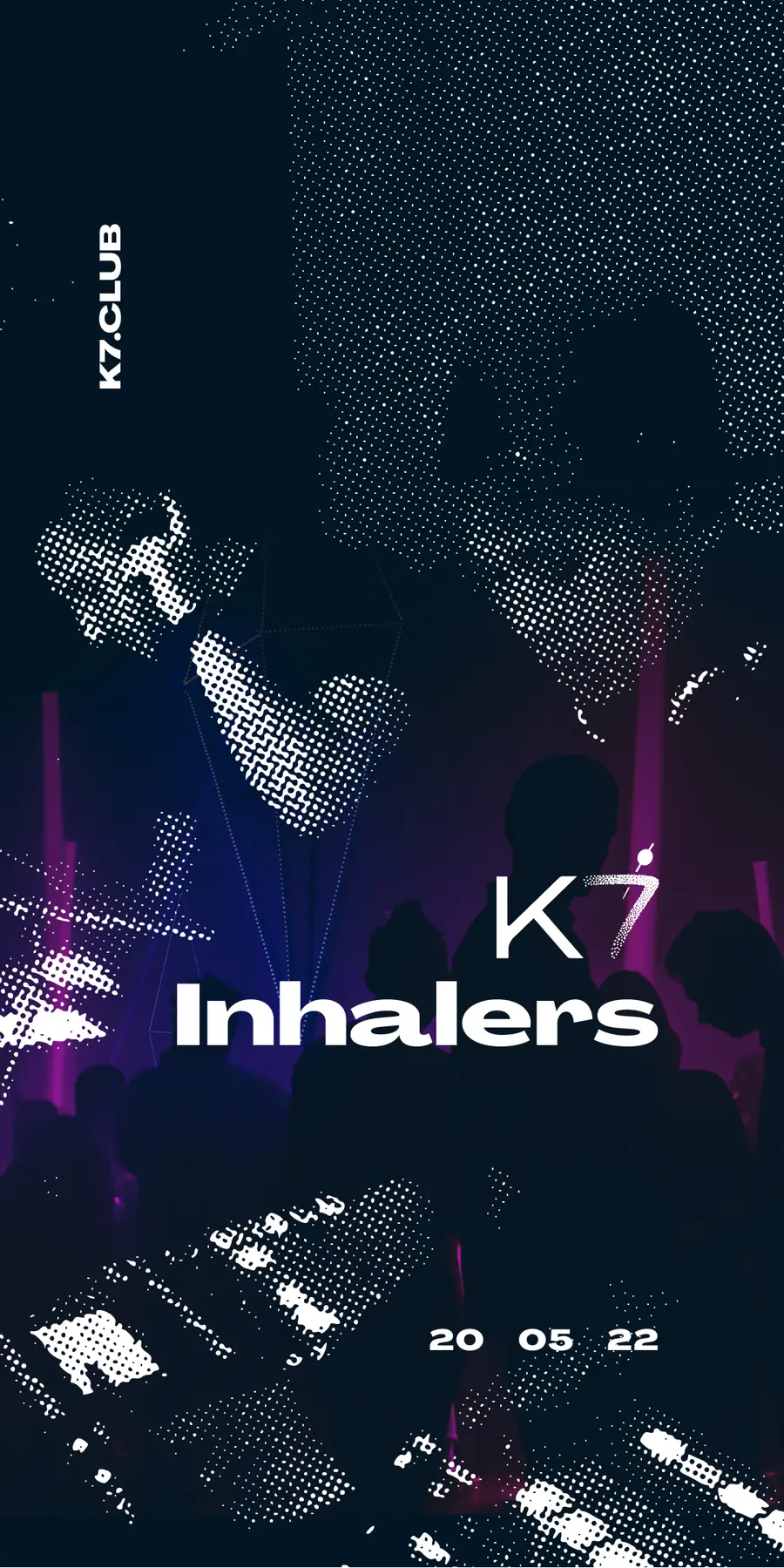
Two K7 event families document that starting point. The first uses green and magenta digital noise with oversized inhale/exhale typography; the second moves into darker halftone performance imagery and violet light. K7 remains the host, while Inhalers becomes the main voice.
The K7 origin / spring 2022
K7 / Inhalers
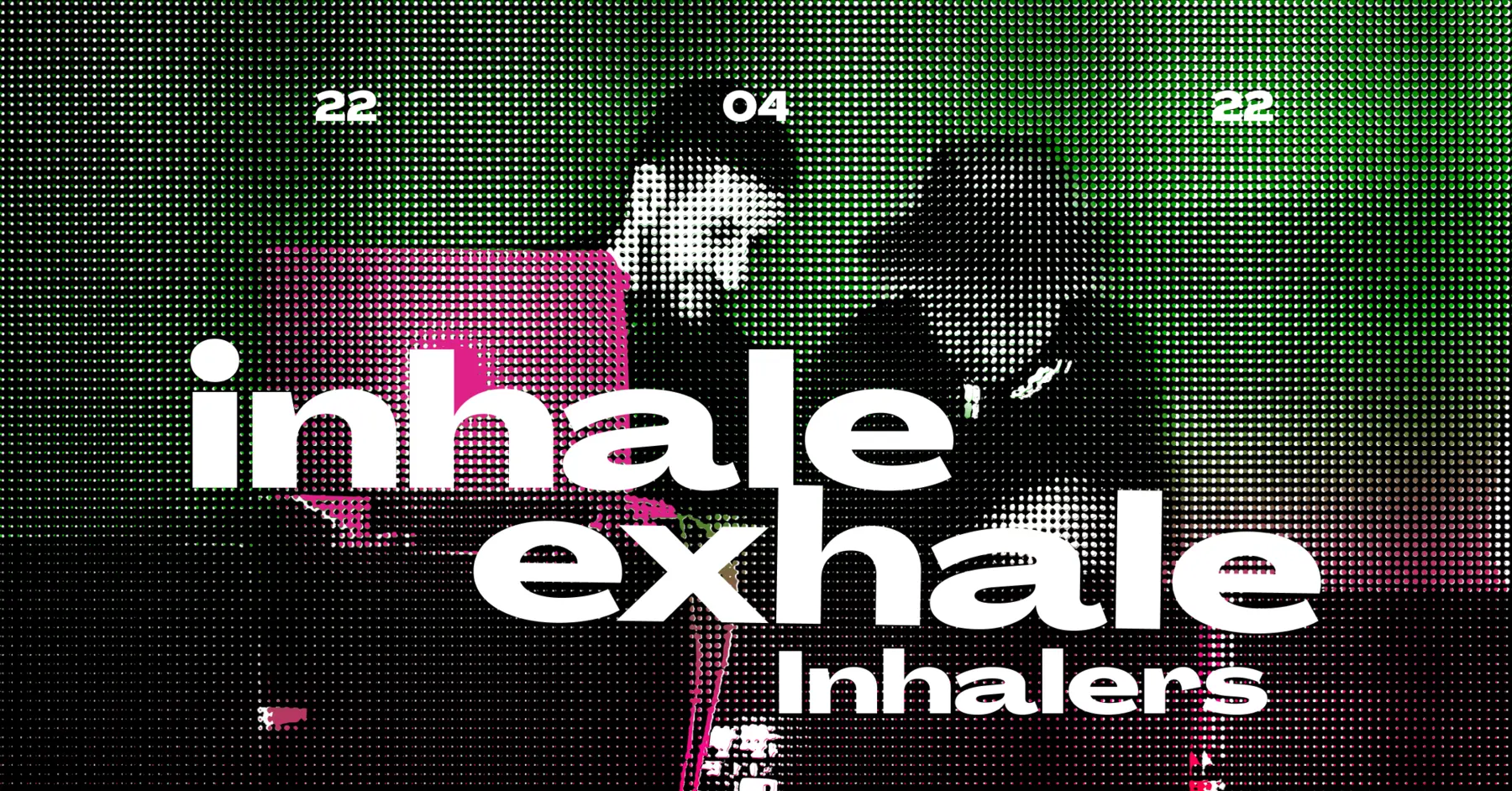
K7 / Inhalers
02 / The brief
Before performing as a duo, both members had worked inside a nightclub as light DJs. In their brief, they described themselves simply as two people excited and passionate about music who felt a strong enough connection to start playing it together.
The name supplied the verbal backbone. Inhale / Exhale became a compact attitude: take in what feels good; release the rest. The identity turns that cycle into repetition, mirrored movement and controlled interruption rather than literal imagery.
03 / Development
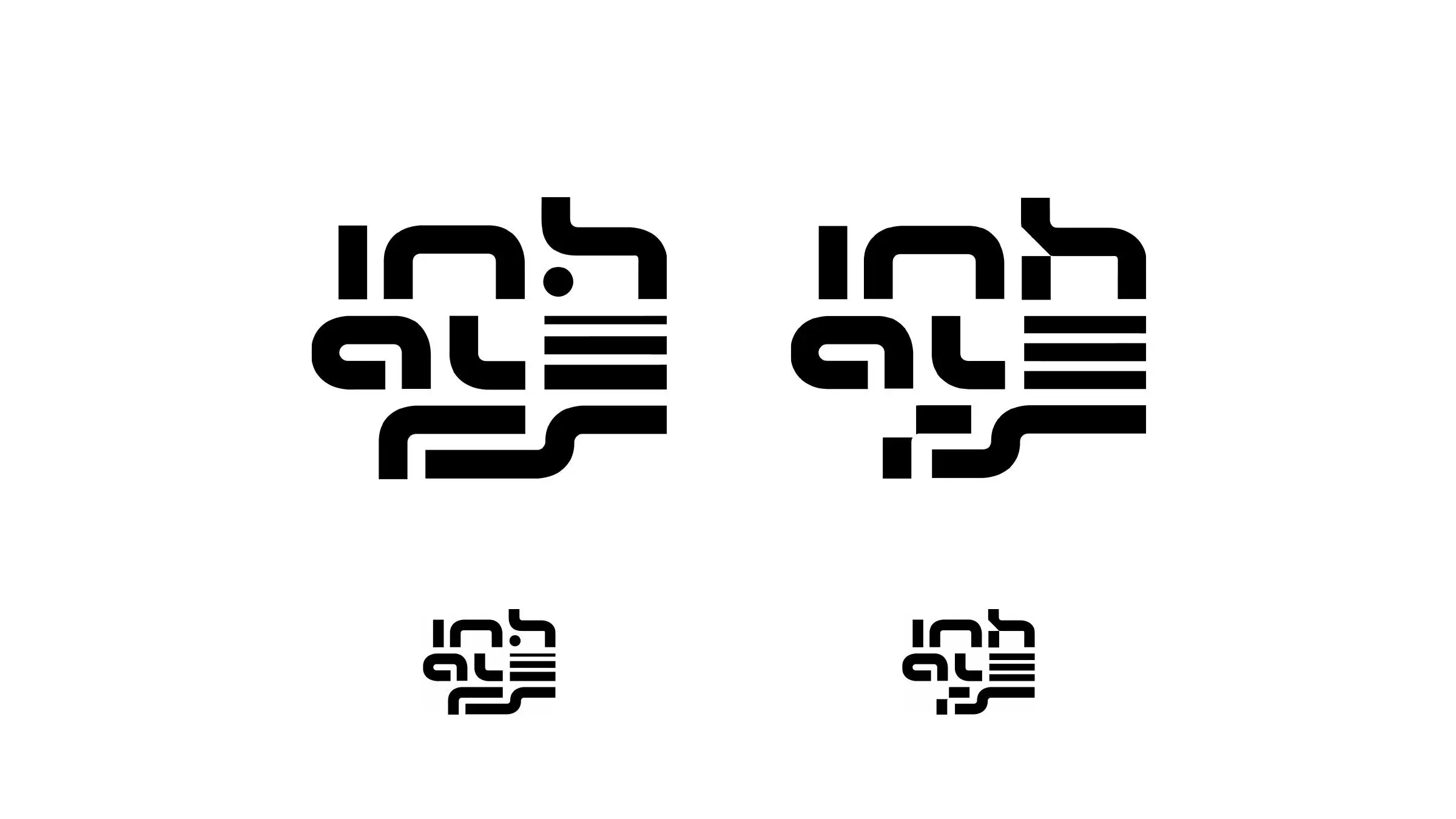
Two initial directions tested how much density the mark could carry. Both built the name from rounded routes, parallel bars and sharp pauses, but differed in how continuously the lower forms connected.
The later refinement compared four variants before settling on a compact square construction. Every adjustment changed the rhythm: where a line stops, where it turns, and how quickly the eye can move from abstract symbol to letterform.
04 / Final identity
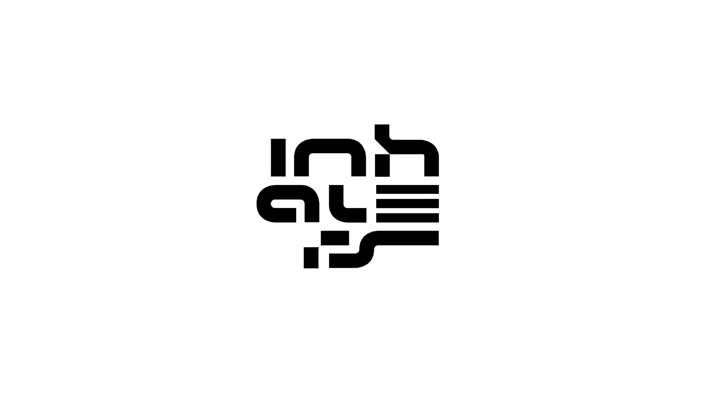
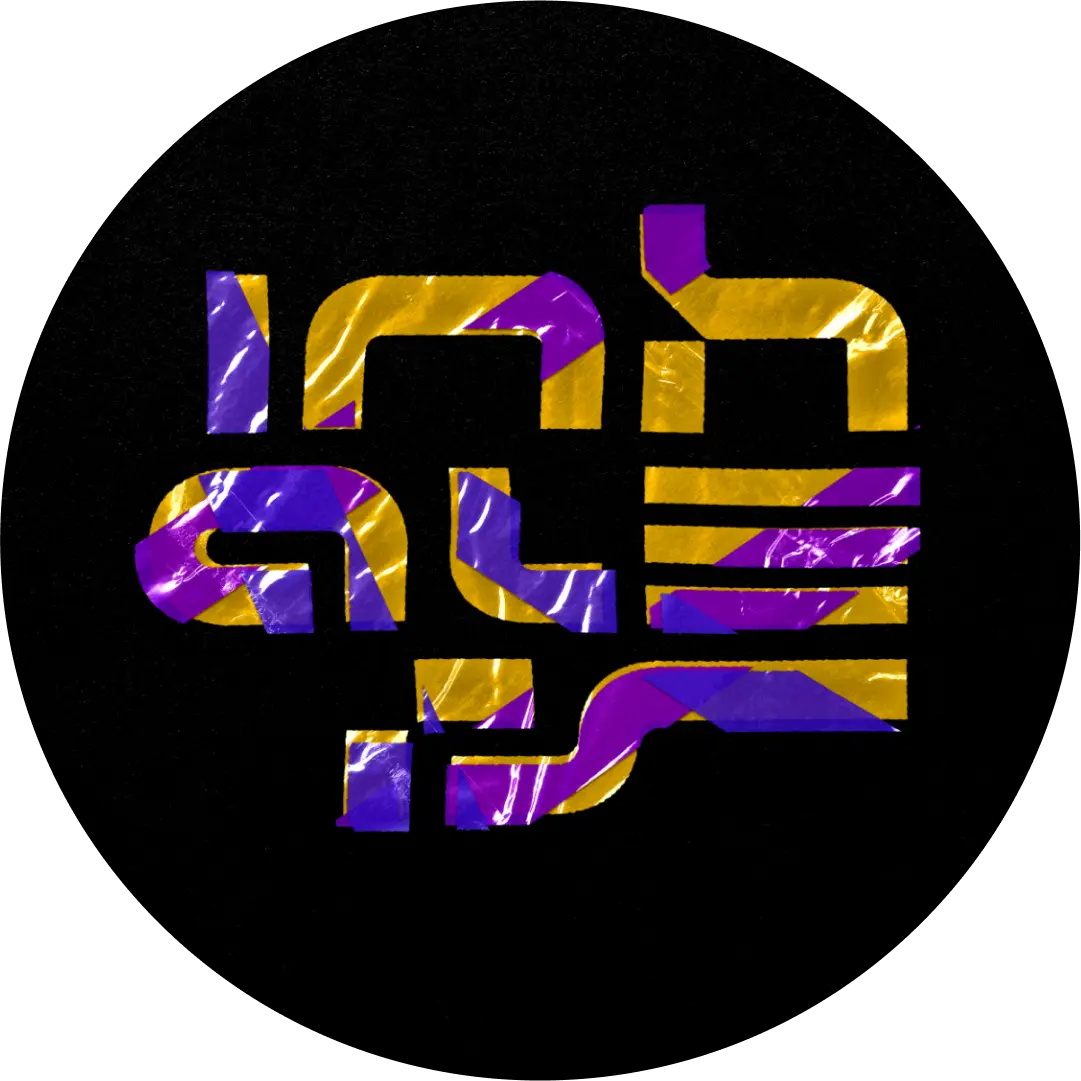
The final mark compresses the name into one interlocking field. Rounded turns suggest flow; repeated bars establish tempo; hard breaks make the composition feel sampled and reassembled. It reads first as a signal, then rewards a closer look with fragments of the letterforms inside it.
Its square proportion makes it effective at the smallest social scale, while black, white and grey master versions keep it usable across photography, screens, print and fabric without adding a second visual language.



Two performers held inside one compact visual field.
Expansion, release and pauses expressed through open routes.
Repeated bars and interrupted strokes that behave like a beat.


Highlights / venues & platforms
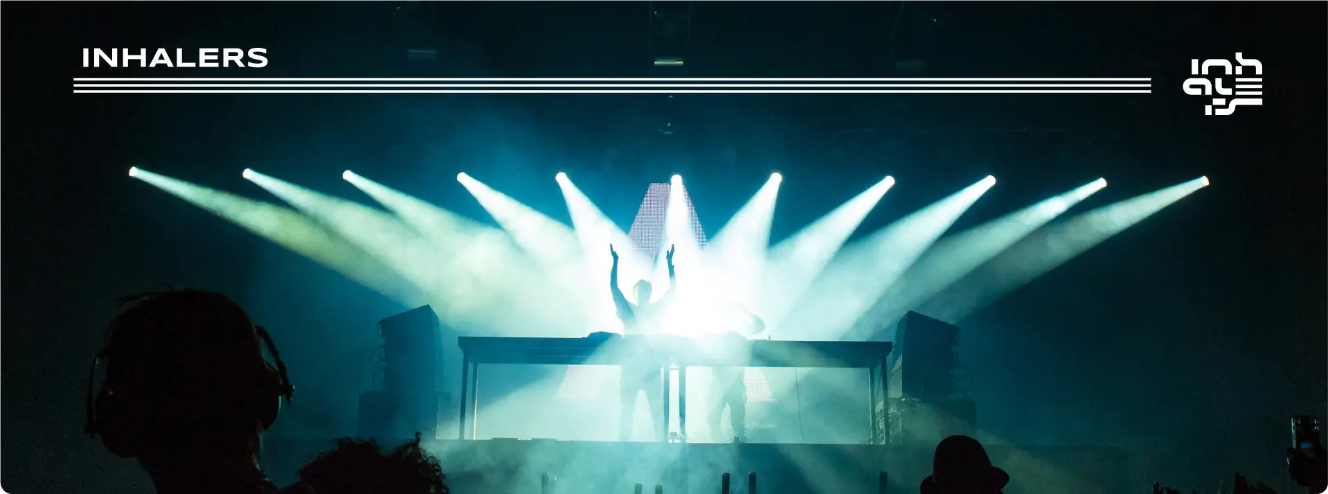
Five destinations, treated as one nocturnal icon family.





06 / Applications
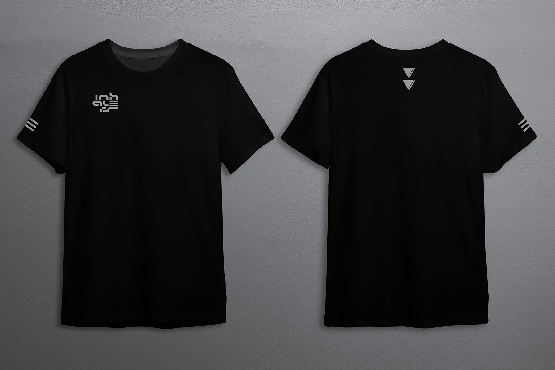
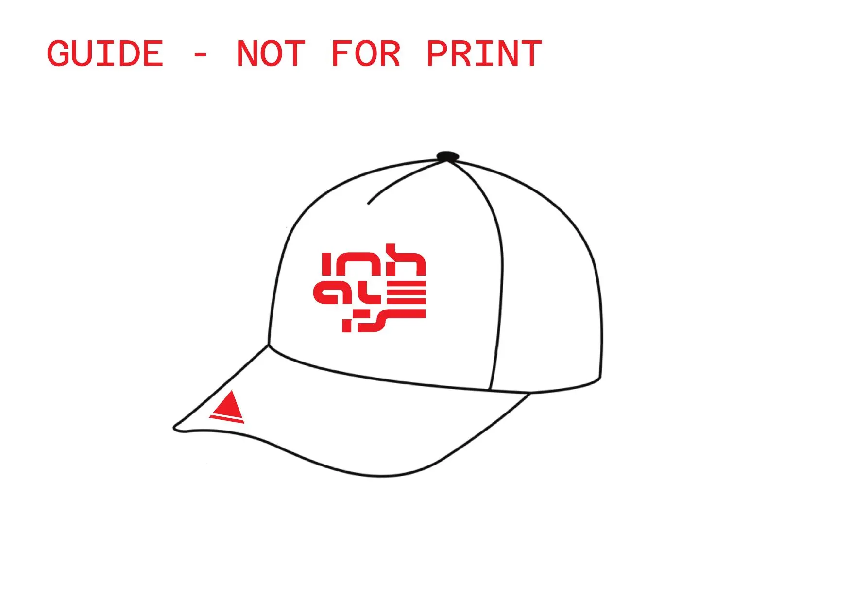
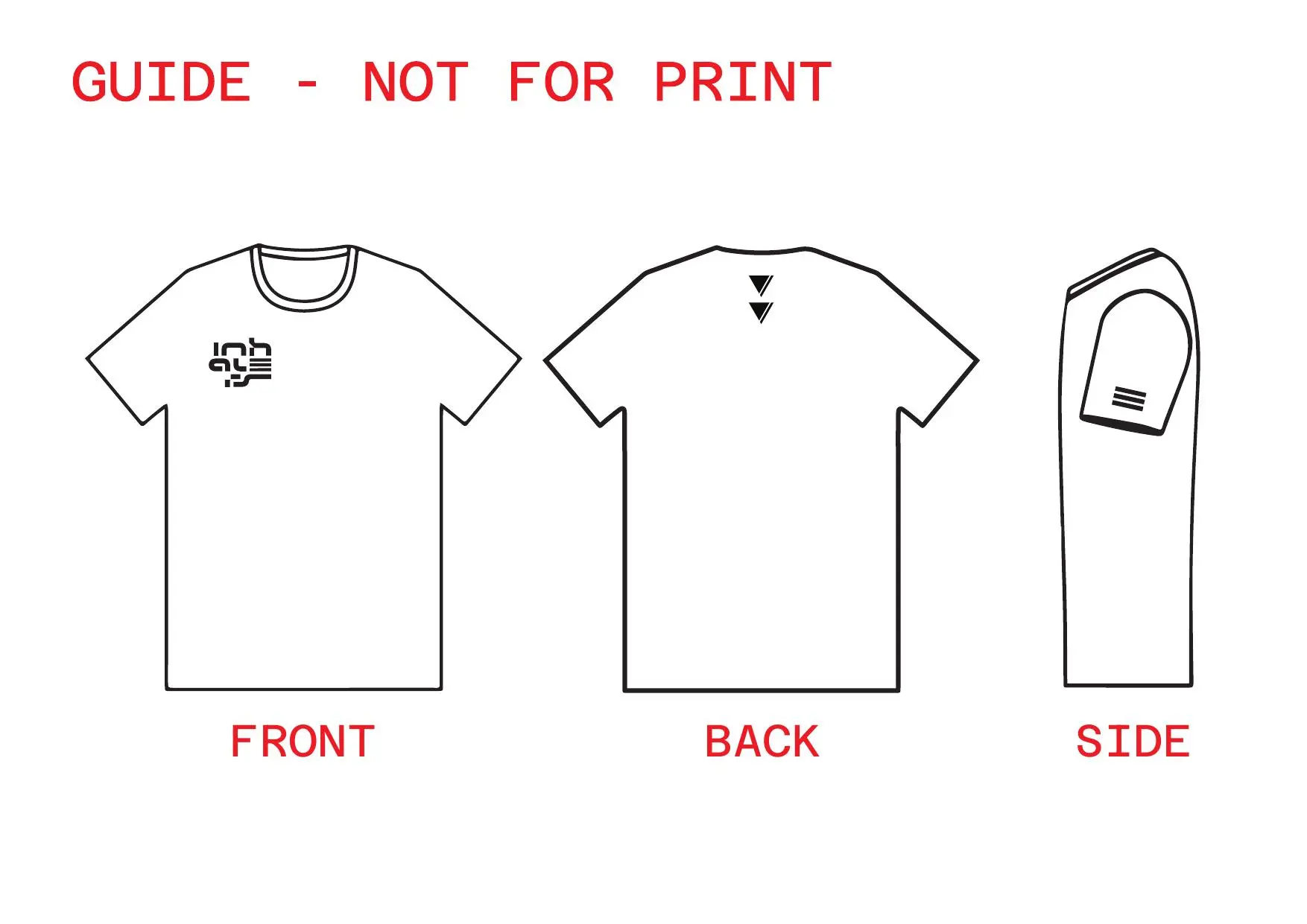
The same compact signature carries business cards, a cap specification and a restrained black T-shirt system. Small secondary devices—the split triangle and three parallel bars—let the apparel hold detail without repeating the full mark everywhere.
The delivered archive also includes an After Effects source for an audio-reactive logo, extending the identity into a time-based format appropriate for DJ sets and digital releases.

07 / The outcome
The project documents a clear progression: event artwork established the first connection, the duo's own story and motto shaped the concept, and the selected mark became a working identity across social, print, apparel and motion.
The system gives the duo a consistent visual identity across profile artwork, event communication, business cards, apparel specifications and an audio-reactive logo source.