Case study / 12
Marks by Hazh.
Symbol studies in visual synthesis, geometric construction and optical refinement.
Project overview
Marks by Hazh is an independent collection of symbols developed across different subjects and visual references. Presented without the surrounding elements of a full identity, the marks place emphasis on silhouette, proportion, rhythm and the relationship between positive and negative space.
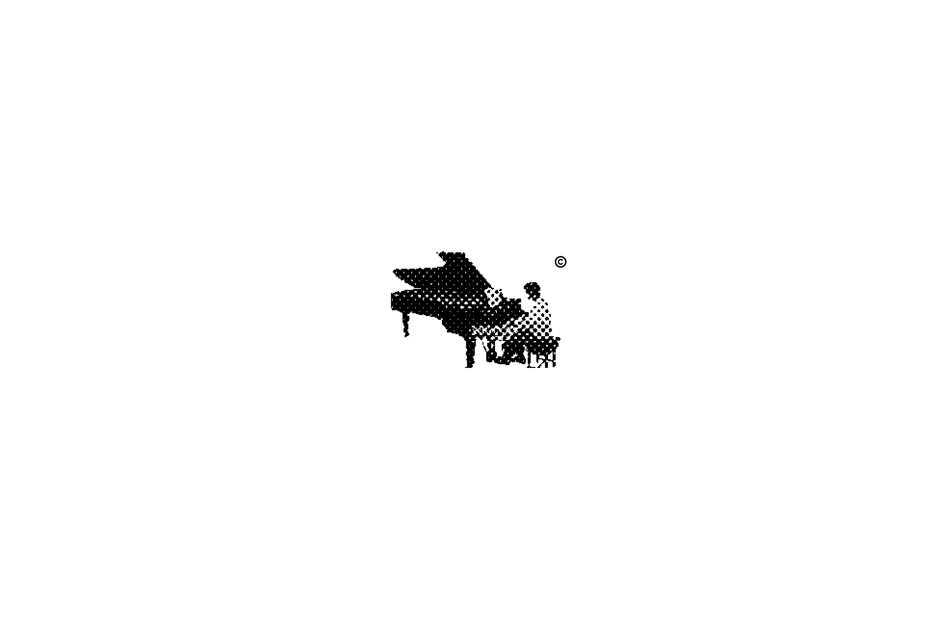
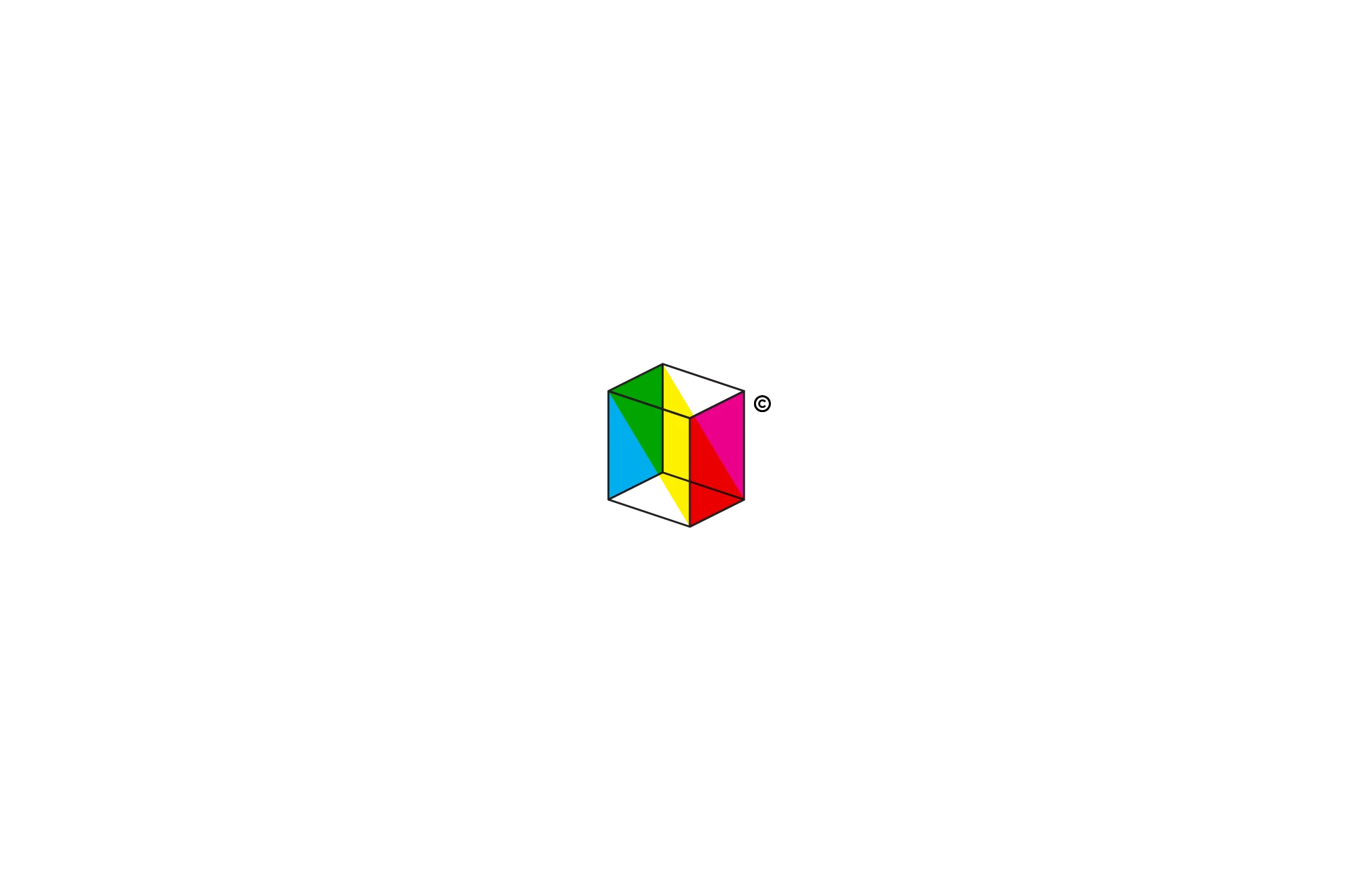
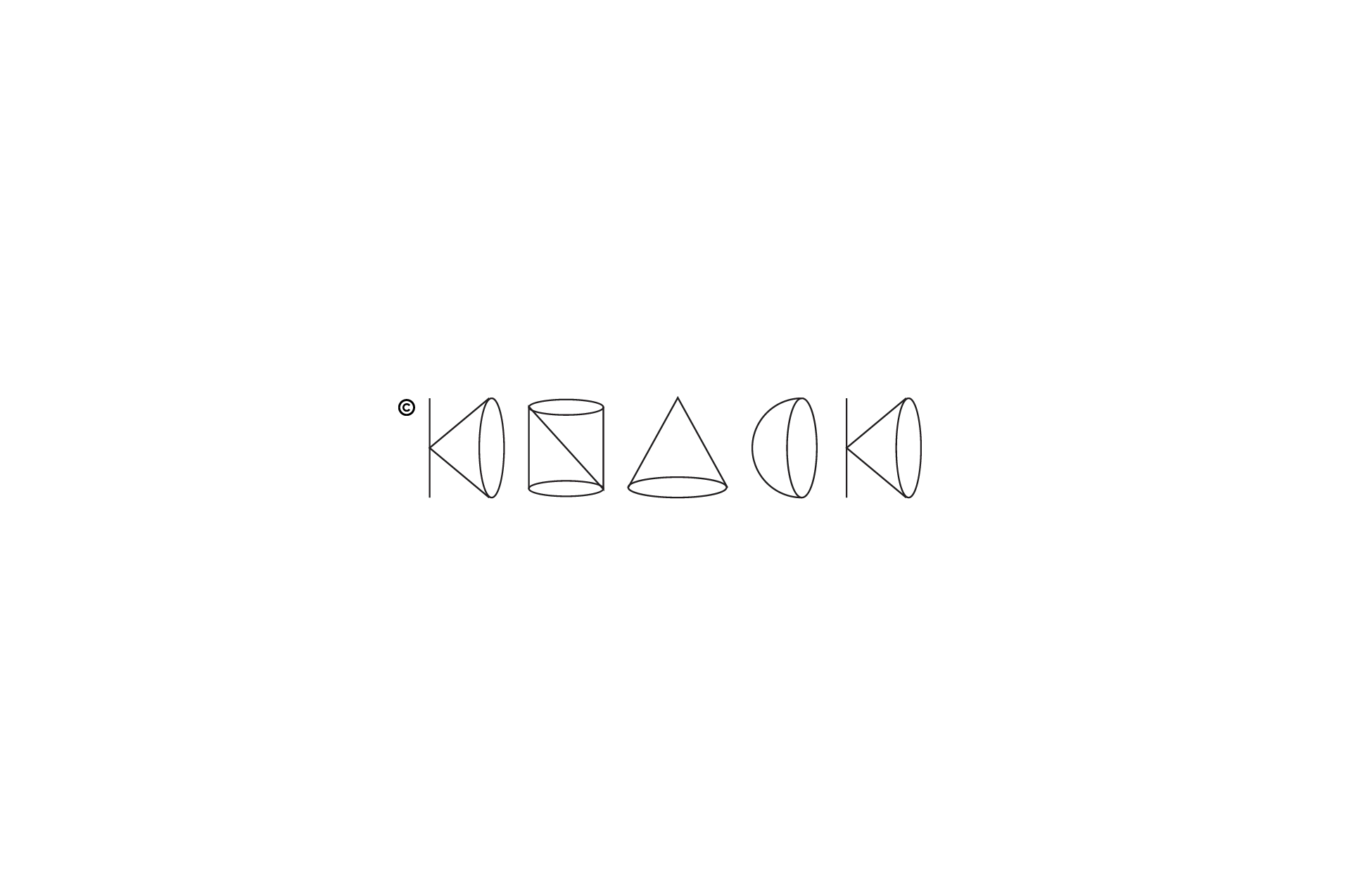
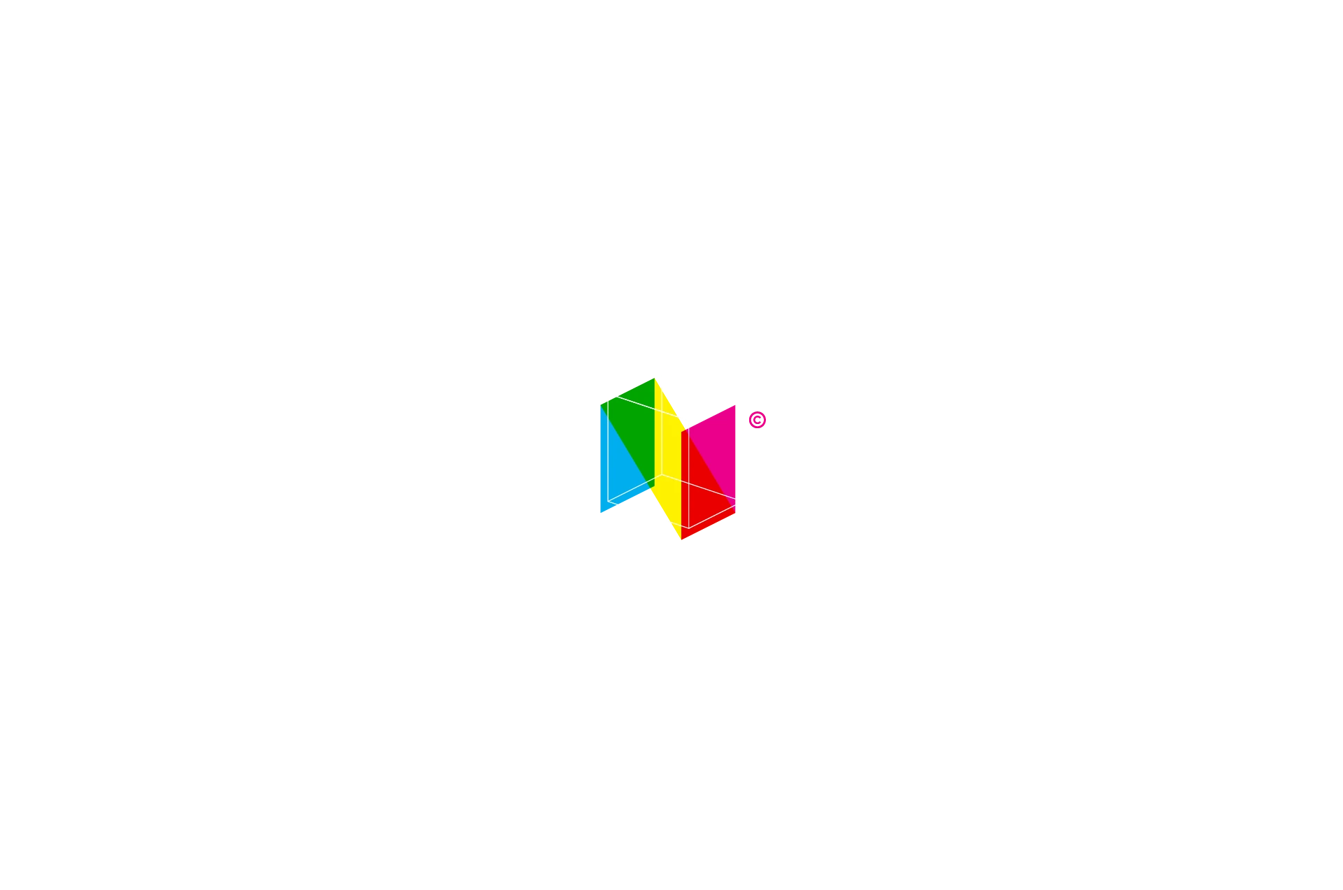
Contextual research and sketching lead into geometric construction and optical refinement. Some concepts combine recognisable forms, including a grand piano and classical bust. Others develop through folded planes, repetition, typographic fragments or an interrupted line, using reduction to clarify the relationship between an idea and its graphic expression.
The collection forms an archive of approaches to symbol design, from fine linear constructions to solid monograms and faceted volumes. Small-scale reproduction and a clear silhouette serve as design criteria, with each study exploring a form that could become the basis of a broader identity.
- Role
- Concept development · Symbol design · Vector construction
- Scope
- Contextual research · Sketch studies · Symbol development · Geometric construction · Optical refinement
- Credits
- Hazhin Roshanysefat
Design highlights
- Optical balance
- Silhouette, proportion and counterspace carry each idea. Optical correction refines the balance between solid form, fine linework and the negative space within the mark.
- Visual synthesis
- Concepts combine recognisable forms, including a grand piano and classical bust, using shared contours and visual overlap to bring different references into a single symbol.
- Geometric reduction
- Folding planes, repeated modules, typographic fragments and interrupted lines provide distinct construction methods, reducing each concept to the forms needed to express its central idea.