Message
Local relevance or general news?
Compare a local-news headline with a broader news benefit in the same layout. Hypothesis: a specific local promise earns more interest from a locally motivated audience.
Case study / 20
An acquisition campaign framework connecting local relevance, brand credibility and the product experience.
01 / The growth brief
SmartNews brings together local reporting, breaking news, weather and stories from a broad range of publishers. Acquisition creative had to turn that breadth into a specific reason to download.
The client’s brief centred on local information: news, weather and alerts. Its hypothesis was that aligning Apple Search Ads (ASA) keyword groups with relevant App Store Custom Product Pages (CPPs) would set clearer expectations and improve conversion.
That was the funnel strategy behind the brief. My contribution was campaign and motion design: translating the app’s benefits into distinct visual directions for acquisition ads. The CPP examples were client references.
02 / Product evidence
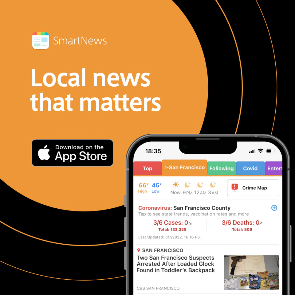
The local-news direction puts a concrete benefit beside the app itself. The visible location, weather and feed connect “Local news that matters” with an experience a reader can recognise.
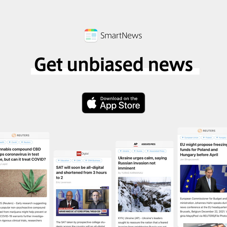
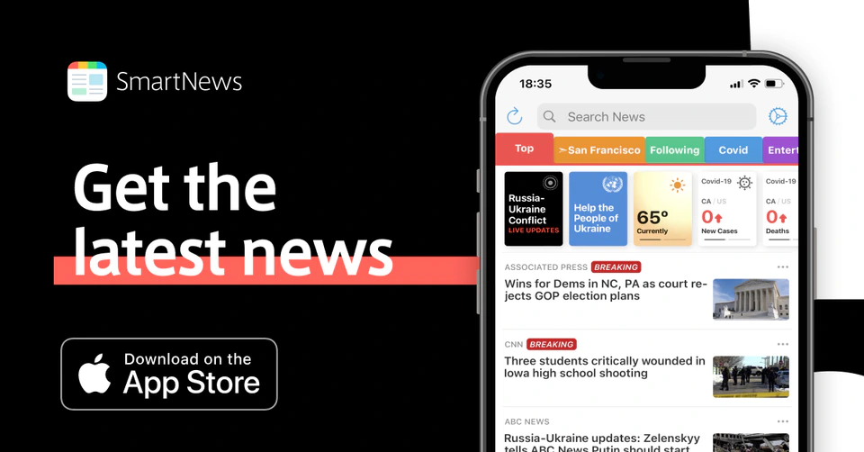
Other compositions change the emphasis: a large phone makes the latest headlines the focus, while a spread of publisher cards supports the campaign’s positioning around different news perspectives.
03 / A repeatable visual language
The creative varies the reason to choose SmartNews while retaining a common vocabulary. Brand colours become underlines, rounded frames and rows of editorial bars. Headlines lead; the app signature and store badges complete the hierarchy.
Trust uses restraint and contrast. Recognition uses a more expressive field of colour. These directions create room for variation without requiring a new visual identity for every message.




04 / Across formats
“Read news on the go” connects the app with an everyday reading moment. The photograph carries that context; a white shape protects the headline, and coloured arcs connect the image to the wider campaign.
Moving from square to landscape changes the photograph’s crop, the headline area and the badge positions. The reading order stays intact: benefit, context, action.


05 / Testing logic
The brief’s central hypothesis was message continuity across acquisition and the App Store. The creative routes suggest further questions about which benefit and evidence deserve priority.
The comparisons below are proposed follow-up tests, not reported experiments. Controlled A/B versions would hold the audience, placement, destination and other design elements constant.
Message
Compare a local-news headline with a broader news benefit in the same layout. Hypothesis: a specific local promise earns more interest from a locally motivated audience.
Evidence
Keep the benefit fixed and vary the supporting visual. Hypothesis: seeing the app helps prospective readers understand what they will get after installing.
Credibility
Compare general reassurance with a specific recognition cue. Hypothesis: an attributed proof point gives an unfamiliar reader a stronger reason to consider the app.
Click response and subsequent install conversion would need to be assessed together. A compelling ad only fulfils the brief when its destination supports the same promise.
06 / Delivery
The work delivered square and landscape static ads across product-led, trust, recognition and everyday-reading directions, alongside a motion graphic for YouTube and web ads.
The design contribution is visible in the relationship between message, evidence and format: benefits change, compositions adapt, and the brand remains recognisable. Performance results and CPP implementation are outside the evidence presented here.